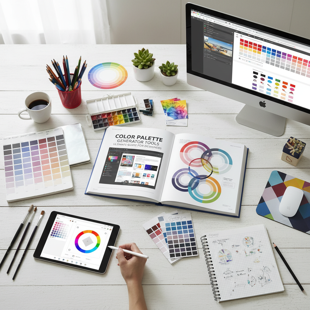
Why Every Designer Needs a Color Palette Generator
In the world of visual communication, color is often the first thing an audience notices. It sets the mood, conveys emotion, and establishes brand identity before a single word is read. However, finding the perfect combination of hues can be a daunting task even for seasoned professionals. This is where a color palette generator becomes an indispensable ally. By leveraging algorithmic logic and color theory, these tools help designers move beyond guesswork to create harmonious, high-impact visual systems. Whether you are building a website from scratch or refreshing a corporate brand, a color palette generator streamlines the creative process and ensures aesthetic consistency across all platforms.
Choosing colors isn’t just about what looks “nice.” It is a strategic decision rooted in psychology and physics. A well-chosen scheme can increase brand recognition by up to 80%. In the first 100 words of your design journey, understanding how a color palette generator works can save you hours of trial and error. These tools offer a bridge between the abstract concepts of color harmony and the practical requirements of digital and print production, providing hex codes, RGB values, and CMYK profiles at the click of a button.
The Fundamentals of Color Theory
To use a color palette generator effectively, one must first understand the basics of color theory. Color theory is a practical combination of art and science that determines how colors interact with each other. It began with Sir Isaac Newton’s color wheel in 1666 and has evolved into a complex field of study used by artists and designers worldwide.
According to the Interaction Design Foundation, color theory helps designers create a visual language that communicates effectively with users. The color wheel consists of primary colors (red, yellow, blue), secondary colors (green, orange, purple), and tertiary colors (mixtures of primary and secondary). When you use a generator, you are often applying specific mathematical relationships on this wheel, such as:
- Analogous: Colors that sit next to each other on the wheel, creating a serene and comfortable design.
- Monochromatic: Different shades and tints of a single hue, perfect for a clean, sophisticated look.
- Complementary: Colors from opposite sides of the wheel that provide high contrast and high energy.
- Triadic: Three colors evenly spaced around the wheel, offering a vibrant yet balanced feel.
Efficiency and Speed
A color palette generator eliminates the need for manual color picking, allowing you to generate hundreds of harmonious schemes in seconds, which is vital for meeting tight deadlines.
Consistency
By providing exact hex codes and values, these tools ensure that your brand colors look identical on mobile apps, websites, and printed marketing materials.
Inspiration
Stuck in a creative rut? Generators can introduce you to unexpected color combinations that you might never have considered, sparking new creative directions.
Accessibility
Modern tools often include contrast checkers, ensuring your color choices meet global accessibility standards for users with visual impairments.
How to Choose the Right Color Palette Generator for Your Project
Not all tools are created equal. When selecting a color palette generator, you should look for features that align with your specific workflow. Some tools focus on pure exploration, while others are built for technical precision. A high-quality generator should allow you to lock certain colors, adjust brightness and saturation, and export your findings in various formats like CSS, ASE, or SVG.
For those looking for a seamless and intuitive experience, the Tools River Color Palette Generator is an excellent choice. It simplifies the process of finding the right balance between primary and secondary colors. By using this tool, you can visualize how different shades interact in real-time, making it easier to build a cohesive brand guide. When designing marketing materials, you might also need a QR code generator to bridge the gap between physical and digital assets, ensuring your branded colors are integrated into every touchpoint.
Advanced Techniques for Your Color Palette Generator
Once you have mastered the basics, you can use a color palette generator to perform more advanced tasks. One such technique is “shading and tinting.” A tint is created by adding white to a base color, while a shade is created by adding black. This is crucial for creating depth in UI design, such as button hover states or background gradients. Most professional tools will automatically generate these variations for you, allowing for a more nuanced and professional finish.
Mastering Brand Identity with a Color Palette Generator
Branding is perhaps the most significant application for a color palette generator. A brand’s color palette is a shorthand for its values and personality. For example, blue often represents trust and stability, which is why it is favored by financial institutions and tech giants. Red, on the other hand, evokes passion, urgency, and excitement, making it a staple for the food and beverage industry.
When creating a brand identity, you typically need a primary color, two or three secondary colors, and a neutral color for text and backgrounds. Using a generator helps you find these “support” colors that don’t compete with your main brand color but instead enhance it. It ensures that the visual hierarchy is maintained, guiding the viewer’s eye to the most important elements of the design.
The Psychological Impact of Colors
Understanding color psychology is essential for any designer. The colors you choose will trigger specific emotional responses in your audience. Here is a brief breakdown of common color associations:
- Blue: Trust, security, and calm. (e.g., Facebook, PayPal)
- Green: Growth, health, and nature. (e.g., Whole Foods, Starbucks)
- Yellow: Optimism, clarity, and warmth. (e.g., Nikon, IKEA)
- Orange: Friendly, cheerful, and confident. (e.g., Nickelodeon, Fanta)
- Purple: Creative, imaginative, and wise. (e.g., Hallmark, Twitch)
- Black: Luxury, elegance, and power. (e.g., Chanel, Apple)
By using a color palette generator, you can experiment with these psychological triggers. If your goal is to create a sense of urgency for a clearance sale, you might use a generator to find a high-contrast complementary scheme featuring bright reds and yellows. Conversely, if you are designing a meditation app, you would look for soft, analogous blues and greens.
Use Cases: Web Design, Branding, and Marketing
In web design, color is used to improve user experience (UX) and interface (UI) navigation. High contrast between text and background is a requirement for accessibility. According to the W3C Web Accessibility Initiative, maintaining a proper contrast ratio ensures that your content is readable by everyone, including those with low vision. Before finalizing your web colors, ensure your site passes a mobile-friendly test to guarantee readability on all screens.
In marketing, color palettes are used to create seasonal campaigns or to differentiate product lines. A color palette generator allows marketing teams to quickly spin up new themes that still feel connected to the parent brand. For instance, a coffee brand might use a warm, earthy palette for their autumn campaign while switching to bright, refreshing pastels for the summer, all while keeping their primary logo color consistent.
Web Design
Focus on legibility and CTA (Call to Action) visibility. Use bold colors for buttons to draw the user’s eye toward conversions.
Social Media
Use vibrant palettes that stand out in a crowded feed. Consistency in color helps followers identify your posts instantly.
Print Media
Ensure your palette translates well from RGB (screen) to CMYK (print). Always check for ink saturation levels.
The Future of Design: AI and the Color Palette Generator
The next generation of design tools is incorporating Artificial Intelligence. An AI-powered color palette generator can analyze millions of successful designs to suggest palettes that are trending or proven to convert. These tools can even extract colors from an uploaded image, allowing you to build a scheme based on a specific photograph or mood board. This level of automation doesn’t replace the designer; rather, it empowers them to make data-driven decisions while maintaining creative control.
As we move forward, the integration of these tools into standard design software like Adobe Creative Cloud and Figma will become even more seamless. The goal is to reduce the friction between an idea and its execution. By mastering the color palette generator today, you are future-proofing your skills for the AI-driven design landscape of tomorrow.
Best Practices for Using Generated Palettes
While a generator provides the ingredients, the designer provides the recipe. Here are some best practices to keep in mind:
- Follow the 60-30-10 Rule: Use your dominant color for 60% of the design, your secondary color for 30%, and an accent color for the remaining 10%.
- Check for Color Blindness: Use simulators to ensure your palette is distinguishable for users with protanopia, deuteranopia, or tritanopia.
- Limit Your Palette: Too many colors can lead to visual clutter. Stick to 3-5 core colors for maximum impact.
- Test in Context: A color that looks great in a small square might feel overwhelming when applied to a full-screen background.
“Color is a power which directly influences the soul,” as Wassily Kandinsky famously said. By utilizing a color palette generator, you are not just picking colors; you are crafting an emotional experience for your audience. It is about finding the balance between logic and intuition to create something truly memorable.
Conclusion
A color palette generator is more than just a convenience; it is a fundamental tool for modern storytelling through design. By understanding the principles of color theory, respecting the psychology of hues, and utilizing powerful tools like the Tools River Color Palette Generator, you can elevate your projects from ordinary to extraordinary. Remember to always prioritize accessibility and consistency, and don’t be afraid to experiment with the unexpected. With the right colors, your design won’t just be seen—it will be felt.
FAQs
A hex code is a six-digit, alphanumeric code used in HTML, CSS, and design software to represent a specific color. For example, #FFFFFF represents white, and #000000 represents black.
Absolutely! While these tools are popular for digital design, the color harmonies they generate apply to any visual medium, including home decor, fashion, and industrial design.
Most professional brand palettes consist of 3 to 5 colors: one primary brand color, one or two secondary colors, and one or two neutral shades for balance.
Yes. RGB (Red, Green, Blue) is used for digital screens, while CMYK (Cyan, Magenta, Yellow, Key/Black) is used for physical printing. A good generator will provide both values.
Many high-quality tools, like the one found on Tools River, are free to use and offer comprehensive features for generating and exporting color schemes.
Read Also:
- SEO Tools Comparison: Semrush vs Ahrefs vs Moz in 2026
- Comprehensive GST Calculator Small Business India Guide: Mastering Compliance and Input Tax Credit
- Contact Us
- Robot.txt Checker
- Image Compression: Boost Website Speed & SEO
- 10 Proven Strategies to Master Your To Do List App for Maximum Productivity
- 10 Essential Insights on the Use of Citation Generator Tools for Perfect Bibliographies