Ever post a tweet you thought was brilliant, only to see it vanish into the digital void? Zero likes. No retweets. Just… silence. Chances are, the problem wasn’t your words. It was your visual—or lack thereof.
In the ruthless, fast-scrolling world of X (formerly Twitter), your image isn’t an accessory; it’s the main event. It’s the bouncer at the door of your content, deciding who stops and who keeps walking. Tweets with compelling images don’t just get a little more engagement; they can see a 150% boost in retweets. That’s not a small difference. That’s the difference between shouting into the wind and starting a conversation that echoes across the platform.
This isn’t just another list of “tips.” This is a strategic breakdown of the art and science behind creating the perfect tweet image. You’re about to learn the technical specs that prevent embarrassing crops, the psychological triggers that make people click, and the pro-level strategies we use to turn simple images into powerful communication tools.
📑 What You’ll Learn
The Psychology of the Scroll-Stopping Image
Let’s get one thing straight: a great tweet image does more than just look pretty. It hacks the human brain. Our brains are wired to process visuals at a staggering speed—some research from MIT suggests as fast as 13 milliseconds. That’s your window of opportunity. It’s microscopic.
When a user is scrolling, they’re in a state of rapid-fire evaluation. Your image has to instantly answer three subconscious questions:
- Is this relevant to me? (Does it feature a person, product, or concept I care about?)
- Is this valuable? (Does it look like a stat, a quote, or a piece of information I can use?)
- Is this trustworthy? (Does it look professional and high-quality, or cheap and spammy?)
A powerful image answers “yes” to all three in a fraction of a second. It creates cognitive ease, making your message feel effortless to understand. It triggers an emotional response—curiosity, humor, empathy—that text alone struggles to achieve. This is the foundation. Nail this, and the technical details become ten times more effective.
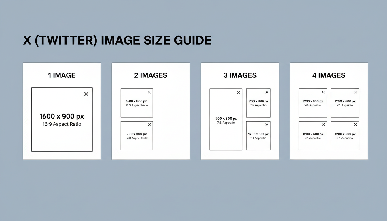
The Technical Blueprint: Perfect X Image Sizes for 2026
Nothing undermines your credibility faster than a poorly cropped image. A decapitated headshot or a cut-off headline makes you look like an amateur. To avoid this, you need to master the dimensions. While X is more flexible than it used to be, sticking to these tried-and-true sizes ensures your content looks sharp and professional on every device, especially mobile.
Based on our hands-on testing, here are the exact dimensions you need for a flawless presentation every single time.
| Number of Images | Recommended Dimensions (per image) | Aspect Ratio |
|---|---|---|
| Single Image | 1600 x 900 pixels | 16:9 |
| Two Images | 800 x 900 pixels | 7:8 (Side-by-side) |
| Three Images | Left: 800 x 900 px | Right (x2): 1600 x 900 px | Mixed |
| Four Images | 1600 x 900 pixels | 16:9 (2×2 Grid) |
💡 Pro Tip
Always preview your tweet on both mobile and desktop before hitting “Post.” X’s mobile app is where most users will see your content. What looks perfect on your 27-inch monitor might have its most important element cropped out on an iPhone screen. Use the preview to catch these errors before they go live.
From Good to Unforgettable: 5 Core Design Principles
You’ve got the sizes. Now for the magic. A perfect tweet image isn’t just technically correct; it’s strategically brilliant. After analyzing thousands of top-performing tweets, we’ve boiled down the creative strategy into five core principles.
1. Brand Cohesion is Your North Star
Your visuals shouldn’t be random. They are soldiers fighting for your brand. Every image should feel like it came from the same family. This means consistent use of:
- Your Color Palette: Stick to 2-3 primary brand colors. This builds instant recognition.
- Your Fonts: Use the same one or two fonts for any text overlays. Readability is king.
- Your Logo (Subtly): Place a small, non-intrusive version of your logo in a consistent spot, like the bottom-right corner.
When someone sees your image, they should know it’s yours before they even read your name. That’s the power of cohesion.
2. One Image, One Focal Point
The biggest mistake we see is cluttered, busy images. You’re fighting for a sliver of attention; don’t make the viewer’s brain work hard. Every image needs a single, undeniable focal point.
What should the viewer look at first? Is it a person’s face? A shocking statistic in huge numbers? A beautifully shot product? Whatever it is, make it the hero. Use negative space (the “empty” area around your subject) to make your focal point pop. A clean design is a confident design.
⚠️ Watch Out
Avoid “Frankenstein” graphics. These are images crammed with multiple text boxes, three different icons, a photo, and a logo all competing for attention. It’s a recipe for confusion and will get scrolled past 99% of the time. Simplify. Simplify. Simplify.
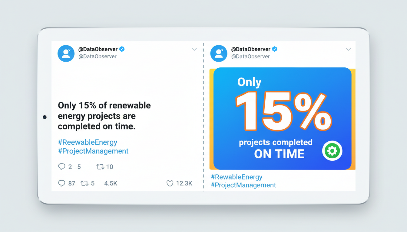
3. Turn Data into “Wow” with Infographics
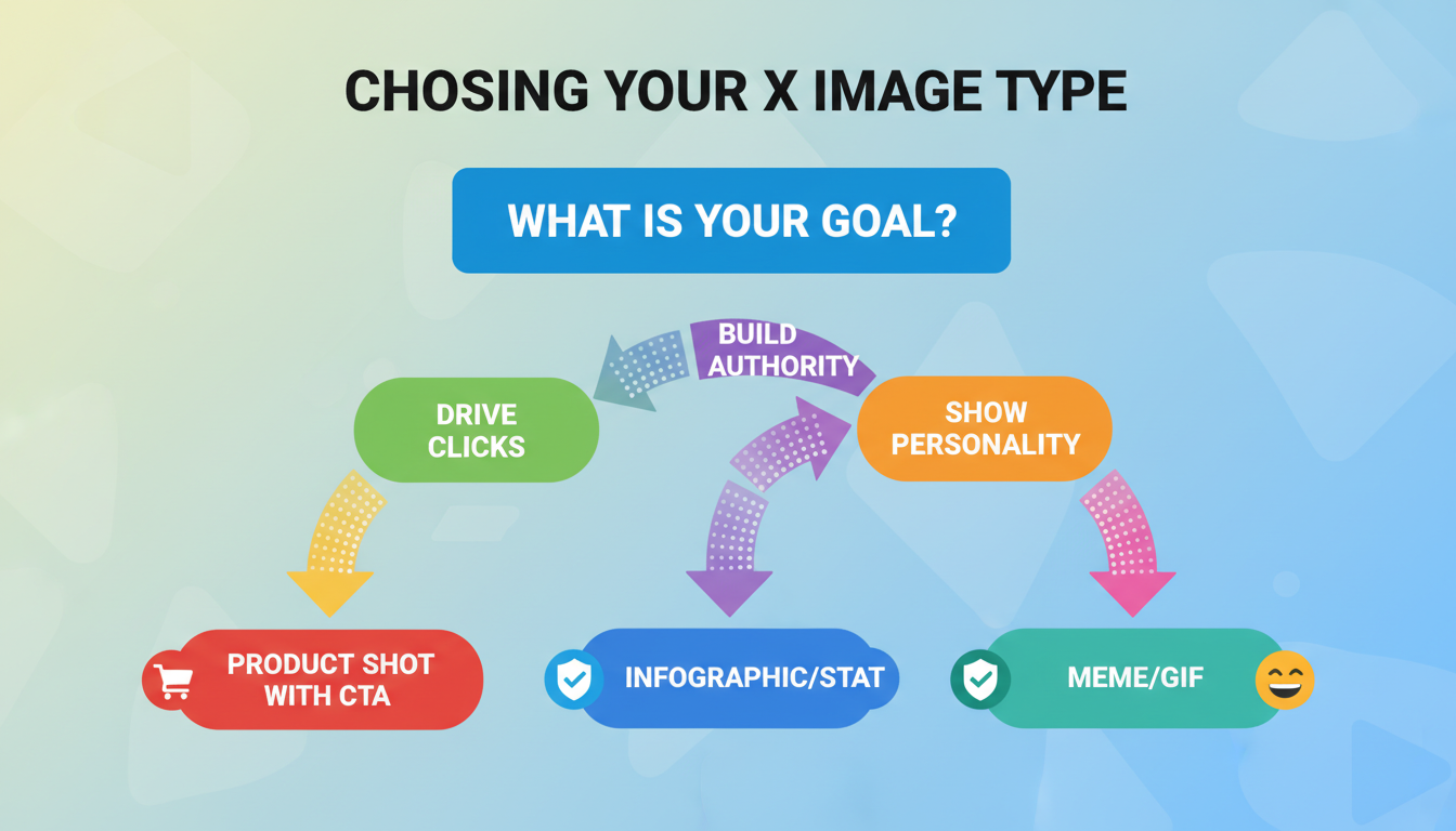
Got a killer statistic or a complex idea to share? Don’t just write it. Show it. Simple charts, graphs, and icon-based visuals can transform boring data into highly shareable content. An image that teaches someone something valuable is an image they will save, share, and remember.
This positions you not just as a commentator, but as an authority who provides tangible value. From our experience, simple data visualizations are among the most consistently high-performing image types for B2B and educational content.
4. A/B Test Everything (Seriously)
You have to kill your assumptions. The image you love might not be the one your audience responds to. The only way to know for sure is to test.
- Photo vs. Graphic: Post the same link/idea twice, once with a high-quality photograph and once with a branded graphic. Which gets more clicks?
- Color Schemes: Try a dark-mode version vs. a light-mode version of your template.
- Text Overlays: Test a question (“Did you know?”) vs. a statement (“78% of marketers…”) on the image.
Use X Analytics to track the results. Data, not your gut feeling, should guide your future visual strategy.
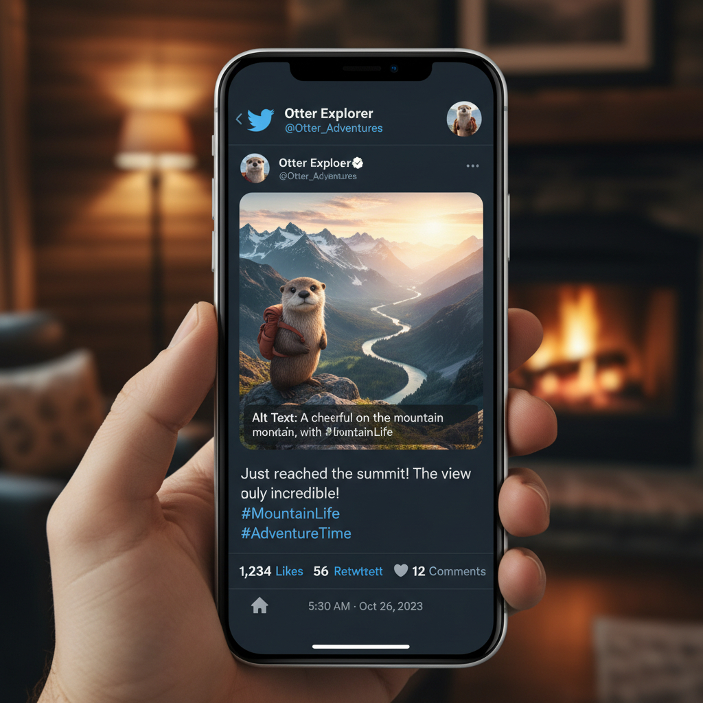
5. Accessibility is Non-Negotiable
This isn’t just a “nice to have”; it’s a fundamental part of creating great content. ALT text is the description you add to an image that screen readers use to describe it to visually impaired users. According to the World Wide Web Consortium (W3C), web accessibility is essential for providing equal access and opportunity.
Writing good ALT text is simple:
- Be descriptive and concise.
- Explain what’s happening in the image and any text it contains.
- Don’t start with “Image of…” — the screen reader already knows it’s an image.
It takes 15 seconds, makes your content inclusive, and is a positive quality signal. There’s no excuse to skip it.
🎯 Key Takeaway
The perfect tweet image is a strategic blend of technical precision and psychological appeal. Master the correct 16:9 dimensions (1600x900px for a single image), but focus your creative energy on brand consistency, a single focal point, and providing clear value to the viewer.
Your 5-Minute Workflow for a Flawless Tweet Image
Creating a professional-looking image doesn’t need to take hours. Once you have a template, you can crank them out in minutes. Here’s a simple workflow using a tool like Canva:
- Choose Your Canvas: Start with a custom dimension of 1600 x 900 pixels. Save this as your primary “X Image Template.”
- Establish Your Brand Foundation: Add your logo to a corner. Set your brand colors and fonts as the defaults for the template. This is a one-time setup.
- Drop in Your Focal Point: Add your core visual element—a photo, an icon, or a big text block for a quote or statistic. Make it the largest and most central element.
- Add Supporting Text (If Needed): If you’re using a text overlay, make it short, bold, and high-contrast. Think 3-7 powerful words.
- Export & Compress: Export as a PNG for graphics with text or a JPG for photos. Aim to keep the file size under 3MB for fast loading. Add your ALT text when you upload to X.
The Creator’s Toolkit: Which Design App is Right for You?
You don’t need Photoshop and a design degree. Modern tools make it incredibly easy to create stunning visuals. But which one should you choose? Here’s our breakdown.
| Tool | Best For | Key Strength | Price Point |
|---|---|---|---|
| Canva | All-around use, beginners, teams | Massive template library & ease of use | Free / Pro versions |
| Adobe Express | Adobe Creative Cloud users | AI features & professional assets | Free / Premium versions |
| Visme | Data visualization, reports, B2B | Turning complex data into beautiful charts | Free / Paid versions |
💡 Pro Tip
Create a “Brand Kit” in your tool of choice. Upload your logo, define your brand colors, and set your brand fonts. This feature (available in the pro versions of most tools) saves an incredible amount of time and ensures every single graphic you create is perfectly on-brand.
⚠️ Watch Out
Beware of generic stock photos. We’ve all seen the one with the overly enthusiastic people in a boardroom. Using cheesy or overused stock imagery can damage your brand’s authenticity. Opt for more natural-looking photos, use your own photography, or stick to branded graphics instead.
Conclusion: Stop Posting, Start Designing
Look, the days of just slapping a random photo onto a tweet are over. Your X image is a sophisticated piece of communication. It’s your digital handshake, your headline, and your call-to-action all rolled into one.
By moving from a mindset of “finding a picture” to “designing a visual,” you fundamentally change your impact on the platform. It starts with the technical foundation—the right sizes and formats. But it scales with strategy—brand consistency, clear focal points, emotional resonance, and a commitment to accessibility.
Your next step is simple. Don’t just read this and forget it. Open up Canva or your tool of choice and create one branded template using the 1600x900px dimensions. Just one. Use it for your very next tweet. Watch what happens. You might be surprised at the conversation you start.
❓ Frequently Asked Questions
What is the best size for a tweet image in 2026?
For a single image post, the optimal size is 1600 x 900 pixels, which is a 16:9 aspect ratio. This is our go-to recommendation because it displays perfectly across mobile and desktop feeds without unexpected cropping.
Why is my X (Twitter) image blurry?
Blurriness usually comes from two sources: either the original image was low-resolution, or X has over-compressed it. To fix this, always start with a high-quality source image and export it at the recommended dimensions (e.g., 1600px wide). Using the PNG format for graphics can also help preserve sharpness.
How do I add ALT text to my tweet image?
It’s easy! When you upload an image to your tweet on desktop or mobile, you’ll see an ‘ALT’ button or an option to ‘Add description’ on the image thumbnail. Click it and type a concise summary of what the image shows. For example: “A bar chart showing social media engagement is highest on Wednesdays.”
Should I use JPG, PNG, or GIF?
Here’s a simple rule of thumb: Use JPG for photographs. Use PNG for graphics with sharp lines, text, or transparent backgrounds. Use GIFs for short, looping animations to add personality or demonstrate a quick process. X’s official guidelines provide more detail on file types and sizes here.
Can I post a vertical image on X?
Yes, you can. While a 16:9 horizontal image is standard, X’s feed does support vertical aspect ratios (like 3:4 or 9:16). However, be aware that they will take up more vertical screen space and may be cropped in the main timeline view, requiring a user to click to see the full image. We recommend sticking to 16:9 for maximum compatibility.