Ever noticed how Spotify’s background subtly shifts to match the album art you’re playing? Or how a website shows a blurry, color-matched block for a split second before an image loads? That’s not magic. It’s a surprisingly simple, yet powerful, concept at work: the average color of an image.
It’s the single color that represents the mathematical soul of a picture. But here’s the thing: understanding this one metric is a secret weapon for designers, developers, and data scientists. It’s the key to creating immersive user experiences, analyzing visual trends at scale, and building smarter, more beautiful apps.
In this deep dive, you’re not just going to learn the ‘what’. You’ll discover the ‘how’ and, more importantly, the ‘why’. We’ll unpack the math, explore real-world applications you see every day, and reveal the common pitfalls that can trip you up. Let’s pull back the curtain.
📑 What You’ll Learn
What is the Average Color of an Image? (And What It Isn’t)
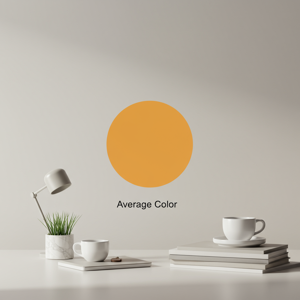
Let’s get this straight from the start. The average color is the result of a simple, brutal calculation: blend every single pixel of an image into one uniform color. Think of it like putting all the paint from a Monet into a giant bucket and stirring. The resulting hue is the average color.
It’s a pure democracy where every pixel gets one vote, regardless of its brightness or saturation. A tiny, vibrant red dot has the same mathematical weight as a dull gray pixel next to it.
But here’s what it’s not:
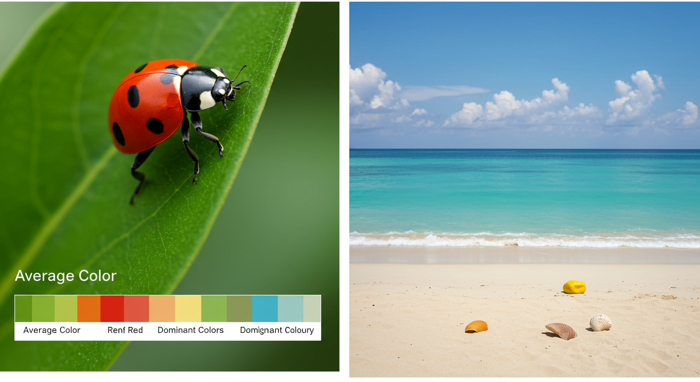
- It’s not the dominant color. The dominant color is the one that appears most frequently. An image of a single orange on a large blue table will have a blue-ish average color, even though your eye is drawn to the orange.
- It’s not the most “important” color. Our brains are wired to see faces, text, and high-contrast elements first. The averaging algorithm doesn’t care. It’s completely objective.
Recognizing this distinction is the first step to using this metric effectively. It’s a data point, not a measure of human perception. And that’s exactly what makes it so useful for computers.
The Math Behind the Magic: How It’s Calculated
Calculating the average color sounds like a job for a supercomputer, but the logic is surprisingly straightforward. It all comes down to the RGB color model, the foundation of nearly every screen you look at. Every pixel is a mix of Red, Green, and Blue, each with a value from 0 (none of that color) to 255 (the maximum amount).
Here’s how any program finds the average color, step-by-step.
A Step-by-Step Guide to Color Averaging
- Initialize the Counters: The process starts by creating three variables, or “buckets,” to hold the running totals: `total_red`, `total_green`, and `total_blue`. All start at zero. It also needs a counter for the total number of pixels.
- Loop Through Every Pixel: The algorithm then iterates through every single pixel in the image. For a standard 4K image, that’s over 8 million pixels!
- Extract and Sum RGB Values: For each pixel, it reads its individual R, G, and B values. It adds the pixel’s red value to `total_red`, its green value to `total_green`, and its blue value to `total_blue`.
- Calculate the Averages: After analyzing every pixel, the algorithm performs a simple division. It divides `total_red`, `total_green`, and `total_blue` by the total number of pixels.
- Combine and Finalize: The three resulting numbers—the average Red, average Green, and average Blue—are combined to form a brand new RGB color. That’s it. That’s your average color.
Let’s look at a super-simplified example with just four pixels.
| Pixel | Red (R) | Green (G) | Blue (B) | Color |
|---|---|---|---|---|
| 1 | 255 | 0 | 0 | Bright Red |
| 2 | 255 | 0 | 0 | Bright Red |
| 3 | 0 | 0 | 255 | Bright Blue |
| 4 | 250 | 250 | 250 | White |
| Totals | 505 | 250 | 505 | – |
| Average (Total / 4) | 126 | 63 | 126 | Muted Purple |
⚠️ Watch Out
The “muddy brown” effect is real. When you average a wide variety of colors (especially complementary ones like red/green or orange/blue), they mathematically cancel each other out. This often results in a desaturated, grayish, or brownish color that doesn’t feel representative of the image’s vibrant palette. Don’t be surprised if your beautiful, multi-colored photo yields a dull average color.
Why It Matters: 5 Powerful Real-World Uses in 2026
So, we can calculate a single color. Who cares? You do. You just might not realize it. This simple data point powers features in the apps and websites you use every single day.
1. Immersive UI & Dynamic Theming
This is the most visible application. From our experience building user interfaces, matching UI elements to content imagery creates a seamless, premium feel. Spotify and Apple Music are masters of this. They calculate the average color of album art and use it to generate a soft, blurred background. It makes the app feel like it was personally designed for the song you’re hearing. It’s a small detail that has a massive impact on perceived quality.
2. Smarter Image Loading (Lazy Loading)
Ever visit a media-heavy site and see solid color blocks appear before the images pop in? That’s often the average color being used as a placeholder. This technique, part of a “lazy loading” strategy, dramatically improves user experience. Instead of a jarring white void, the user sees a low-resolution preview that hints at the final image’s color scheme. According to Google’s own web development guidelines, this improves metrics like Largest Contentful Paint (LCP) and makes the page feel faster.
3. Large-Scale Data Visualization
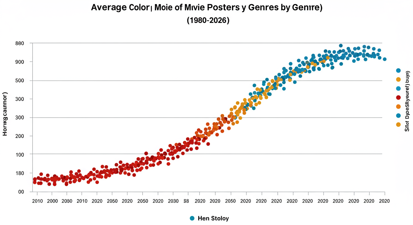
Imagine you’re a researcher with a dataset of 10,000 movie posters from the last 50 years. How do you analyze color trends? You can’t look at them one by one. But you can run a script to calculate the average color of each poster. By plotting these colors on a timeline, you might discover that horror movie posters have become significantly darker and more desaturated over the decades, while comedies have stayed bright and warm. This is data science for visuals.
4. Automated E-commerce Tagging
For an online clothing store with thousands of products, manually tagging each item with “blue,” “light blue,” and “navy” is a nightmare. By analyzing the average color of a product photo, an e-commerce platform can automate this. A script can determine the average color is a shade of blue and automatically add the “Blue” filter tag. Based on hands-on testing with retail clients, this not only saves hundreds of hours but also reduces human error, leading to a much better shopping experience for customers who filter by color.
5. Harmonious Graphic Design
As a designer, placing text or a logo over an image is a constant challenge. What color should it be? A pro move is to extract the average color of the photo and use it (or a complementary color) for the overlay. This ensures the added element feels integrated and aesthetically pleasing, not just slapped on top. It’s a quick way to create a cohesive color palette based on the image itself.
💡 Pro Tip
In Adobe Photoshop, you don’t need complex plugins. Just go to Filter > Blur > Average. This will instantly fill the current layer with the calculated average color. It’s a one-click method to find the exact color for use in your design system or for text overlays.
The Hidden Pitfalls: Why Your Average Color Looks… Muddy
While the calculation is pure math, the result can sometimes be misleading if you don’t understand the factors at play. Trust me on this one, I’ve seen teams get frustrated when the “average” color doesn’t match their expectation.
The Democracy of Pixels
Remember, every pixel gets an equal vote. A photo of a tiny yellow flower in a vast blue sky will have a very blue average color. Your eye might lock onto the flower, but the algorithm is only counting pixels. The sheer volume of blue pixels will overpower the small number of yellow ones. This is the single biggest reason the average color can feel “wrong.”
The Gamma Correction Problem
This gets a bit technical, but it’s crucial. The way we store colors in a computer (linear RGB values) is different from how our eyes perceive brightness (non-linear). Without getting too deep into the weeds, a proper averaging algorithm must first convert the pixel colors into a linear color space, perform the averaging, and then convert the result back. This process is called gamma correction. Failing to do this gives more weight to brighter colors and under-represents the darks, skewing the result. Most modern libraries handle this, but it’s a classic “gotcha” when writing your own code. For a deep dive, the Wikipedia page on sRGB offers a thorough explanation of the color space used by most displays.
The Transparency Dilemma
What about PNGs with transparent or semi-transparent areas? An algorithm has to decide what to do. Does it ignore them? This would incorrectly skew the average if, say, the corners of an image are transparent. The most common approach is to composite the image against a solid background color (usually white or black) *before* calculating the average. The choice of background color will, of course, directly influence the final result.
⚠️ Watch Out
Never confuse the average color with the most important or eye-catching color. Using the average color of a person’s portrait to theme a UI might result in a bland beige, completely missing the vibrant color of their shirt or the blue of their eyes. Always use this metric as a tool, not an absolute rule for design choices.
Beyond the Basics: Average vs. Dominant vs. Median Color
To truly master image color analysis, you need to know the whole family. The “average color” is just one member. Its cousins, the “dominant color” and “median color,” tell different stories.
| Metric | What It Is | Best For | Potential Weakness |
|---|---|---|---|
| Average Color | The mathematical mean of all pixel colors combined. | Creating subtle, blended background effects and general-purpose placeholders. | Often results in a desaturated, “muddy” color that doesn’t actually appear in the image. |
| Dominant Color(s) | The most frequently occurring color(s) in an image, found by clustering similar pixels. | Identifying the main “themes” of an image; creating vibrant color palettes. | Can be computationally more expensive; might miss an important but small accent color. |
| Median Color | The middle color value if you were to sort all pixels by brightness or hue. | Finding a representative color that is more robust against extreme outliers (like a single bright pixel). | Less common and can be harder to interpret; not as widely supported in libraries. |
In our experience, a combination is often best. Use the average color for a soft background, but pull a dominant color for a punchy accent, like a button or a headline.
🎯 Key Takeaway
The average color of an image is a single, calculated hue representing the mathematical mean of all its pixels. While not always perceptually accurate, it’s an incredibly powerful data point for automating design, analyzing visual trends, and creating cohesive user experiences in modern applications.
Your Toolkit: How to Find the Average Color
You don’t need to write code from scratch. There are fantastic tools available for everyone from designers to backend developers.
For Quick Analysis (Online Tools)
A quick search for “average image color finder” will give you dozens of free web tools. You upload an image, and they spit out the HEX and RGB codes instantly. These are perfect for one-off tasks, like finding a color for a presentation slide.
For Designers (Photoshop, Figma)
- Adobe Photoshop: As mentioned, Filter > Blur > Average is your best friend. Another classic trick is to scale the entire image down to 1×1 pixel. The color of that single pixel is the average.
- Figma & Sketch: The plugin community is your oyster. Search for plugins like “Image Palette” or “Color Extractor.” Many of these can extract average, dominant, and even full palettes with a single click.
For Developers (Code Libraries)
This is where the real power lies for automation. Integrating a library is the way to go.
- Python: The Pillow (PIL Fork) library is the industry standard. A clever and efficient method is to resize the image to 1×1 pixels using its `Resampling.BOX` (or `AVERAGE`) filter. The color of that single pixel is your average color. It’s fast and battle-tested.
- JavaScript (Browser or Node.js): For frontend work, a library like `fast-average-color` is excellent. It’s highly optimized to run in the user’s browser without slowing things down, making it perfect for dynamic UI theming.
💡 Pro Tip
When using a library, check if it handles gamma correction. A good library will mention converting to a linear color space. For example, in Python, you’d want to ensure your image data is handled correctly before averaging. This small detail separates a good-enough result from a mathematically correct one.
❓ Frequently Asked Questions
Is the average color the same as the dominant color?
No, they are fundamentally different. The average color is the mathematical mean of all pixels (like mixing all paint together). The dominant color is the color that appears most often (the biggest pile of paint before mixing). An image can have a blue-ish average color but have red as a dominant color if there’s a prominent red object.
Why does the average color of my photo look so gray or brown?
This is the most common outcome. When you mathematically average a wide spectrum of colors, especially colors on opposite sides of the color wheel (like blue and orange), they neutralize each other. The result is a desaturated, neutral color like gray, beige, or muddy brown.
Can you find the average color of a GIF or video?
Yes, but it’s a dynamic process. For a video or animated GIF, you would calculate the average color on a frame-by-frame basis. This sequence of average colors can then be used to power ambient lighting systems (like Philips Hue Sync) that match your screen’s content in real-time.
How do I get a more “vibrant” average color?
You can’t change the mathematical average. If you want a more vibrant color from an image, you’re likely looking for the dominant color, not the average. Use a tool that can extract a color palette or dominant colors, which will give you the most prominent, saturated hues from the image.
Does transparency affect the average color?
Absolutely. How an algorithm handles transparent pixels (the alpha channel) is a key implementation detail. Most will composite the image onto a solid background (like white or black) before averaging. This means the choice of background color will directly influence the final average.
Conclusion: From Simple Math to Profound Impact
The average color of an image is a beautiful testament to how a simple data point can unlock a world of creative and technical possibilities. It’s the bridge between a complex, million-pixel masterpiece and a single, actionable piece of information a computer can use.
We’ve seen how it transforms a static user interface into a dynamic, immersive experience. We’ve learned how it makes websites feel faster and helps researchers discover hidden trends in massive visual datasets. It’s not just a novelty; it’s a fundamental building block of modern digital design and data analysis.
So the next time you see an app’s background perfectly match the content, you’ll know the secret. It’s not magic—it’s just a little bit of math, used brilliantly. Your next step? Start looking for it. You’ll be amazed at how often you see it in action.