Here’s a hard truth: You can spend 20 hours editing the perfect video, nailing the pacing, and color-grading like a Hollywood pro—but if your thumbnail sucks, nobody is going to watch it. It’s harsh, but it’s the reality of the platform in 2026.
I’ve audited hundreds of channels over the last few years, and the pattern is always the same. Creators obsess over the content but treat the thumbnail as an afterthought. They throw something together in five minutes before hitting publish. That’s a fatal mistake.
Your thumbnail isn’t just artwork; it’s a psychological trigger. It’s a promise. And in a feed that scrolls infinitely, you have less than 0.4 seconds to hook a viewer’s brain. If you don’t, they’re gone.
In this guide, we aren’t just talking about “making it bright.” We’re diving into the specific, data-backed YouTube thumbnail hacks that leverage human psychology to force a pause in the scroll. These are the exact strategies used by the top 1% of creators to dominate the algorithm this year.
📑 What You’ll Learn
- 1. The “Face Forward” Rule & Micro-Expressions
- 2. High-Contrast Color Psychology
- 3. The 3-Word Text Strategy
- 4. Mastering the Curiosity Gap
- 5. Branding That Builds Trust
- 6. The Split-Screen Transformation
- 7. Strategic Element Isolation
- 8. The Mobile-First Audit
- Step-by-Step: The Pre-Publish Checklist
- Frequently Asked Questions
1. The “Face Forward” Rule & Micro-Expressions
Humans are social creatures. Our brains are hardwired to seek out other faces. It’s an evolutionary survival mechanism that you can leverage for clicks. But in 2026, simply slapping a smiling face on a thumbnail isn’t enough. Viewers have become desensitized to the generic “YouTuber smile.”
To actually stop the scroll, you need to use exaggerated micro-expressions that convey a specific, high-stakes emotion. We’re talking about shock, confusion, intense focus, or genuine joy.
Why this works: When a viewer sees a face displaying an intense emotion, their mirror neurons fire. They subconsciously want to know what caused that reaction. It creates an instant narrative question.
💡 Pro Tip
The Eye Contact Rule: Ensure the eyes in your thumbnail are in the top third of the image. If you’re looking at the camera, you’re connecting with the viewer. If you’re looking at an object in the thumbnail, you are directing the viewer’s gaze to that object. Use this directional cue intentionally.
2. High-Contrast Color Psychology
Your thumbnail is fighting a war for attention against a sea of white (or dark mode) background. If your colors are muddy or muted, you lose. The best thumbnails utilize high-contrast complementary colors that vibrate against each other.
I’ve seen creators fail because they use “aesthetic” pastel palettes. While pretty on Instagram, they get crushed on YouTube. You need saturation and separation.
| Color Combination | Psychological Trigger | Best Use Case |
|---|---|---|
| Yellow on Black | Warning, Caution, High Visibility | Tutorials, Warnings, “Mistakes to Avoid” |
| Red on White | Urgency, Excitement, Stop Sign | Vlogs, Challenges, Breaking News |
| Neon Green on Purple | Unnatural, Tech-focused, Gaming | Gaming, Crypto, Futurism |
| Blue on Orange | Cinematic Contrast (Teal & Orange) | Travel, Lifestyle, High-Production |
According to color psychology research, warm colors (reds, yellows) tend to advance toward the eye, while cool colors (blues, greens) recede. Use warm colors for the element you want the viewer to click on.
3. The 3-Word Text Strategy
Here is where 80% of creators mess up. They try to put the video title in the thumbnail. Don’t do this. The title is already next to the image! Repeating it is a waste of valuable real estate.
Your thumbnail text should complement the title, not repeat it. It needs to be punchy, readable, and short. I follow the strict 3-Word Rule. If you can’t say it in three words or less, use an icon instead.
- Bad: “How I Made $1000 in One Day” (Too long, small text)
- Good: “$1,000/Day” (Big, bold, readable)
⚠️ Watch Out
The Bottom Right Corner: Never put text or crucial visual elements in the bottom right corner of your thumbnail. YouTube places the video timestamp (duration) there, which will cover up your text. I’ve seen huge channels make this mistake and lose clicks because the punchline was hidden behind a “10:02” black box.
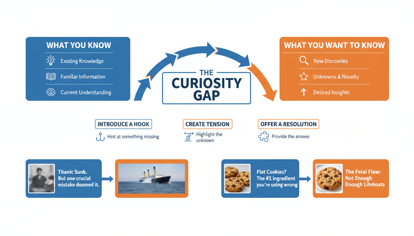
4. Mastering the Curiosity Gap
The “Curiosity Gap” is a concept popularized by behavioral economists. It’s the void between what we know and what we want to know. Your thumbnail should widen this gap.
Think about it like a magic trick. Show the setup, imply the result, but hide the method. If you show the entire solution in the thumbnail, why would anyone click? You’ve already given them the dopamine hit.
Examples of the Curiosity Gap:
- Blurring the result: A blurred object with a sharp arrow pointing to it.
- The “Impossible” Scenario: A visual that seems to defy physics or logic (e.g., a Minecraft build that looks illegal).
- Reaction without Context: Someone looking terrified at a computer screen, but we can’t see the screen yet.
5. Branding That Builds Trust
In 2026, brand recognition is a shortcut to clicks. If a viewer loved your last video, you want them to instantly recognize your next one in the sidebar without even reading the channel name.
This doesn’t mean every thumbnail looks identical. It means having a consistent “visual language.” This could be a specific font (like MrBeast’s distinct style), a recurring color grade, or a specific layout. Consistency builds trust, and trust increases CTR over time.
6. The Split-Screen Transformation
The human brain loves transformation. We are obsessed with progress. Whether you are in fitness, finance, home renovation, or even coding, the “Before and After” format is one of the most powerful thumbnail hacks in existence.
The trick is to make the contrast extreme. The “Before” should look desaturated, messy, or sad. The “After” should be vibrant, organized, and happy. Use a distinct divider line—diagonal lines often work better than vertical ones because they add dynamism to the composition.
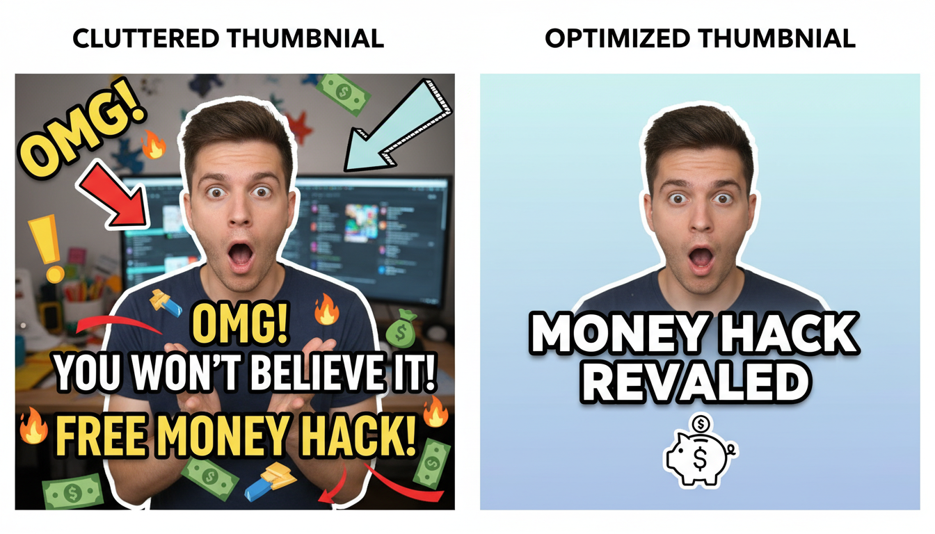
7. Strategic Element Isolation
Clutter is the enemy of clicks. When a viewer is scrolling on a phone, a busy thumbnail looks like a mess of pixels. You need to practice Element Isolation.
Cut your subject out of the background (using tools like Photoshop or Canva’s background remover). Then, place them on a simplified background. Add a subtle outer glow or drop shadow to separate the subject from the back. This creates depth and tells the viewer’s eye exactly where to look.
8. The Mobile-First Audit
Here is a statistic you cannot ignore: over 70% of YouTube watch time happens on mobile devices. Yet, most creators design their thumbnails on massive 27-inch 4K monitors.
What looks detailed and beautiful on your desktop often looks like an unreadable smudge on an iPhone Mini. You must design for the smallest screen.
💡 Pro Tip
The “Squint Test”: Before exporting your thumbnail, zoom out until it’s the size of a postage stamp on your screen. Now, squint your eyes. Can you still understand what the image is about? Can you read the text? If not, simplify it. Big shapes and high contrast win on mobile.
Step-by-Step: The Pre-Publish Checklist
Don’t hit publish until you’ve run your thumbnail through this 5-step gauntlet. This process ensures you aren’t missing any easy wins.
- Check the Timestamp Zone: Ensure the bottom-right corner is completely free of text or key visuals.
- The Contrast Check: Turn your monitor to grayscale (black and white). Does the text and subject still pop against the background? If it blends in, you need more contrast.
- The Competitor Scan: Search your target keyword on YouTube. Look at the top 5 results. Does your thumbnail stand out, or does it look exactly like theirs? If everyone is using red, use green.
- The 3-Word Audit: Read your text overlay. Can you remove a word? Can you make the font bigger?
- Mobile Preview: Send the image to your phone and look at it there. This is the most accurate test of reality.
🎯 Key Takeaway
Great thumbnails aren’t about artistic talent; they are about communication efficiency. Your goal is to create a “Pattern Interrupt” using high-contrast colors, emotional faces, and curiosity gaps. If you can stop the scroll for just one second, you’ve won half the battle.
❓ Frequently Asked Questions
Does changing a thumbnail reset the video’s algorithm ranking?
No, it doesn’t reset your ranking, but it can re-trigger the algorithm to test the video again. If you change a thumbnail and the CTR improves, YouTube will likely start showing the video to more people. It’s a common strategy to revive older, underperforming videos.
What is a good Click-Through Rate (CTR) in 2026?
According to YouTube’s official data, the average CTR across the platform is between 2% and 10%. However, for a video to really take off, you should aim for a CTR of 6% or higher. Keep in mind that as a video goes viral and reaches a broader (less targeted) audience, the CTR naturally drops.
Should I use arrows and red circles?
Ironically, yes. People claim to hate “clickbait” arrows and circles, but the data proves they still work effectively to direct eye movement. The key is to use them to highlight something genuinely interesting, not to deceive the viewer.
How long should I wait before changing a thumbnail?
Give a new video at least 24 hours. YouTube needs time to find the right audience. If the CTR is significantly below your channel average after 24-48 hours, that is the time to swap in a new variation.
Is A/B testing thumbnails worth it for small channels?
Absolutely. Even with smaller sample sizes, A/B testing helps you learn what your specific audience prefers. Tools like TubeBuddy or YouTube’s native “Test & Compare” feature (rolled out widely by 2025) make this essential for growth.
Final Thoughts: It’s All About the Click
Look, you can have the most life-changing content in the world, but it means nothing if nobody clicks. These thumbnail hacks aren’t about tricking people; they are about giving your content the fighting chance it deserves.
Start applying these principles today. Audit your last five videos. Could the contrast be higher? Is the text too small? Is the emotion clear? Make the tweaks, watch the analytics, and let the data guide you. The algorithm is waiting.
Want to dive deeper into visual hierarchy? Check out the Nielsen Norman Group’s research on eye-tracking patterns to understand exactly how users scan images.