Introduction to Modern Color Design
In the world of visual communication, color is more than just an aesthetic choice; it is a silent language that speaks directly to the subconscious. Whether you are building a brand from scratch or designing a high-conversion landing page, the colors you choose can determine the success of your project. This is where a professional color palette generator becomes an indispensable ally. By using a color palette generator, designers can move beyond guesswork and tap into the mathematical harmony of color theory to create balanced, engaging, and accessible designs.
Choosing the right colors can be overwhelming. With millions of hex codes available, finding a set of four or five colors that work perfectly together requires either years of training or the right digital tools. In this guide, we will explore the nuances of color selection and demonstrate how a color palette generator can streamline your creative process, ensuring that every project you touch resonates with its intended audience.
The Science Behind a Great color palette generator
A high-quality color palette generator is built upon centuries of artistic principles and optical science. It isn’t just picking random colors; it is calculating the relationships between hues based on the color wheel. Understanding these relationships is the first step toward mastering design. According to the Interaction Design Foundation, color theory is a framework that guides how we use color to communicate effectively.
When you use a tool like the Tools River Color Palette Generator, you are essentially interacting with an algorithm that understands contrast, saturation, and brightness. These tools allow you to lock in a primary brand color and instantly see its complementary or analogous counterparts, saving hours of manual trial and error.
Monochromatic Schemes
Uses different shades, tones, and tints of a single base color. It creates a clean, cohesive look that is easy on the eyes and perfect for minimalist branding.
Analogous Schemes
Uses colors that are next to each other on the color wheel. These palettes are often found in nature and feel harmonious and serene.
Complementary Schemes
Utilizes colors from opposite sides of the wheel. This creates high contrast and high energy, making certain elements pop in marketing materials.
Key Features of a color palette generator
Not all tools are created equal. When searching for the best color palette generator, you should look for features that enhance your specific workflow. A great tool should offer hex code exports, RGB/CMYK values, and the ability to visualize how colors look in a real-world layout. This helps in maintaining consistency across different media, from digital screens to printed business cards.
Why Every Designer Needs a Reliable color palette generator
Efficiency is the cornerstone of a professional design career. While inspiration can strike at any moment, relying solely on a “gut feeling” can lead to inconsistent results. A color palette generator provides a structured starting point. It allows you to explore variations you might not have considered, such as split-complementary or triadic schemes, which add complexity and depth to your work.
Furthermore, accessibility has become a non-negotiable aspect of modern design. A robust color palette generator often includes contrast checking features. This ensures that your text remains readable against your chosen background colors, meeting WCAG (Web Content Accessibility Guidelines) standards. As noted by Smashing Magazine, the meaning of color can vary across cultures, but the technical requirement for legibility is universal.
Speed and Agility
Generate dozens of viable color schemes in seconds, allowing for rapid prototyping and client presentations without the manual labor.
Scientific Accuracy
Ensure that your colors are mathematically balanced, preventing the “muddy” look that happens when uncoordinated colors are mixed.
Cross-Platform Unity
Easily translate your digital palettes into print-ready formats, ensuring your brand looks the same on a smartphone as it does on a billboard.
How to Use a color palette generator for Branding
Branding is where color psychology truly shines. Before you even open a color palette generator, you must define the personality of the brand. Is it energetic and youthful? Or is it trustworthy and corporate? Once the brand identity is established, the generator helps you find the exact shades that evoke those specific emotions.
For instance, a financial institution might lean toward deep blues and grays to signify stability. Using a color palette generator, a designer can find the perfect “Navy Blue” and then identify an accent color, like a soft gold or a crisp white, to add a touch of luxury and clarity. This systematic approach ensures that the brand remains cohesive across all touchpoints.
Integrating Your color palette generator into Workflows
To get the most out of these tools, you need to integrate them into your broader project management strategy. Knowing how to choose online tools workflow is essential for any digital professional. Once you have generated your palette, the next step is often preparing your visual assets. If you are working with photography, you might need an image resizer to ensure your color-corrected images fit perfectly within your web layouts.
By keeping your color palette generator at the heart of your design stack, you create a bridge between the conceptual phase and the execution phase. You can export your palette directly into software like Adobe Photoshop, Figma, or Canva, maintaining a single source of truth for your project’s visual identity.
Step 1: Define the Mood
Identify 3-5 keywords that describe your project. This will guide your initial color search in the generator.
Step 2: Pick a Base
Choose one primary color that represents the core value of the brand. Lock this color in the generator tool.
Step 3: Refine and Test
Generate variations (analogous, triadic) and test them against real content to ensure readability and impact.
Maximizing Creativity with a color palette generator
One of the biggest misconceptions is that using a color palette generator stifles creativity. In reality, it does the opposite. By handling the technical aspects of color harmony, it frees the designer to focus on composition, typography, and storytelling. It acts as a digital mood board that can be shared with clients to get early buy-in on a creative direction.
Consider the “60-30-10 rule” in interior and web design. This rule suggests that 60% of a space should be a dominant color, 30% a secondary color, and 10% an accent color. A color palette generator makes it incredibly easy to find these three tiers of color. You can experiment with bold, saturated accents against neutral backgrounds to create a modern, high-impact user interface.
“Color is a power which directly influences the soul,” as many famous artists have noted. By utilizing modern technology, we are simply finding more efficient ways to harness that power. Whether you are a seasoned pro or a beginner, the right tool can elevate your work from mediocre to masterpiece.
Conclusion
Mastering color is a journey that combines art, science, and psychology. A color palette generator is the ultimate shortcut for designers who want to produce professional, harmonious, and accessible work without the stress of manual calculation. From defining brand identities to ensuring web accessibility, these tools provide the foundation upon which great design is built. By integrating a reliable generator into your daily workflow, you can ensure that every project you deliver is visually stunning and strategically sound.
FAQs
A color palette generator is a digital tool that helps designers create harmonious color schemes based on color theory principles. It uses algorithms to suggest sets of colors that look good together, providing hex codes and other values for easy use in design software.
Color theory provides the rules and guidelines for how colors interact and how they affect human perception. It ensures that designs are aesthetically pleasing, readable, and capable of conveying the right emotional message to the audience.
Yes, most professional generators provide color values in multiple formats, including CMYK, which is the standard for print. This allows you to maintain color consistency between your digital designs and physical marketing materials.
While there is no hard rule, most designers recommend a palette of 3 to 5 colors. This usually includes a primary color, a secondary color, an accent color, and neutral shades for backgrounds or text to ensure balance and clarity.
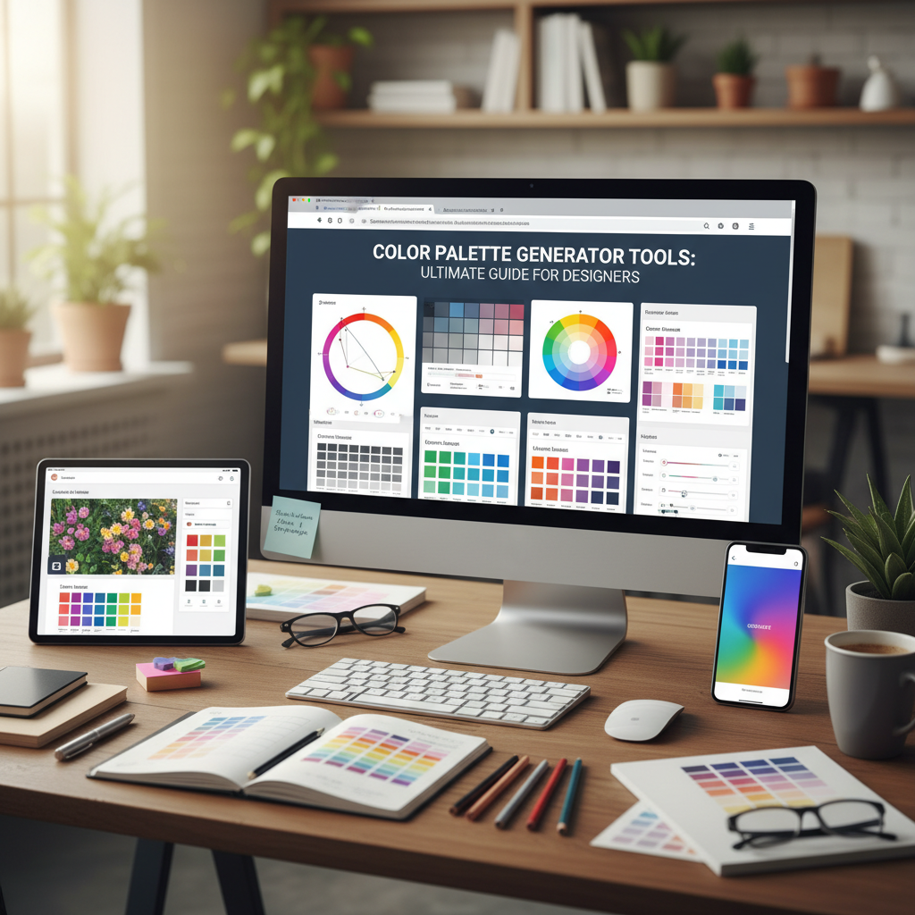
Yes, the Tools River Color Palette Generator is fully responsive, meaning you can generate and explore color schemes on your smartphone, tablet, or desktop computer whenever inspiration strikes.