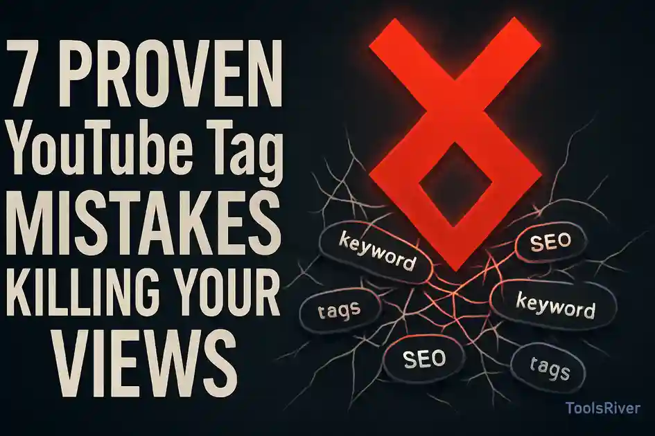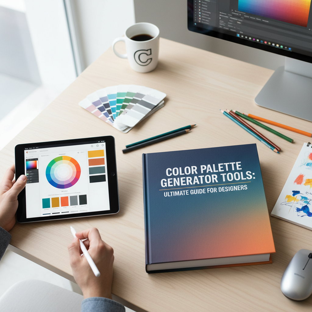
Why Every Designer Needs a Reliable Color Palette Generator
In the world of visual communication, color is much more than just an aesthetic choice; it is a powerful language that speaks directly to the subconscious. Whether you are building a brand from scratch, designing a high-converting landing page, or creating social media graphics, the colors you choose will determine how your audience feels and reacts. However, finding that perfect combination of hues can be a daunting task for even the most seasoned professionals. This is where a color palette generator becomes an indispensable tool in your creative arsenal.
A professional color palette generator simplifies the complex process of color selection by using mathematical algorithms based on color theory. Instead of guessing which shades look good together, these tools provide you with harmonized schemes that ensure visual balance and accessibility. By using a tool like the Tools River Color Palette Generator, you can quickly explore thousands of combinations, refine your brand identity, and ensure consistency across all your marketing materials. In this guide, we will explore the science of color, the psychology behind different hues, and practical ways to implement these palettes into your daily workflow.
Mastering Color Theory with a Color Palette Generator
To use a color palette generator effectively, it is helpful to understand the basic principles of color theory. Color theory is the collection of rules and guidelines that designers use to communicate with users through appealing color schemes in a visual interface. At the heart of this theory is the color wheel, a circular diagram representing the relationships between different colors.
When you input a seed color into a generator, it calculates related colors based on specific geometric relationships on the wheel. Understanding these relationships allows you to choose a scheme that fits the specific mood of your project. For instance, if you are working on a complex data visualization project, you might need a wide range of distinct colors, whereas a minimalist portfolio might only require a few subtle variations of a single hue. If you are also working on the content side of your site, using an SEO title generator can help ensure your headlines are as catchy as your visuals.
Monochromatic Schemes
These use various tones, shades, and tints of a single base color. They are easy on the eyes and create a sense of cohesion and simplicity, making them perfect for clean, modern web designs.
Analogous Harmonies
Analogous colors sit next to each other on the color wheel. This creates a serene and comfortable design often found in nature, providing a gentle transition between different elements.
Complementary Contrast
Complementary colors are opposites on the wheel. This high-contrast combination is vibrant and draws immediate attention, making it ideal for call-to-action buttons and primary branding elements.
Triadic Balance
A triadic scheme uses three colors spaced evenly around the wheel. It offers high contrast while maintaining harmony, resulting in a lively and balanced look for diverse marketing materials.
Exploring Harmony Types in a Color Palette Generator
When using a color palette generator, you aren’t just looking for colors that “look pretty.” You are looking for a functional harmony that serves a purpose. For example, a split-complementary scheme offers the high contrast of a complementary palette but with less tension. By experimenting with these different harmony types within a digital tool, you can discover unique combinations that you might never have considered manually.
Expert designers often suggest starting with a single “hero” color that represents the core value of the brand and then letting the generator suggest secondary and accent colors. This approach ensures that your design remains grounded while benefiting from the mathematical precision of algorithmic color matching. For a deeper dive into the science of visual perception, you can explore resources from the Interaction Design Foundation.
The Psychology of Color in Branding and Marketing
Every color carries a specific psychological weight. Before you finalize your selection in a color palette generator, you must consider what message you want to send. Color psychology is the study of how colors affect human behavior and decision-making. In marketing, this is crucial because the right color can increase brand recognition by up to 80% and significantly influence purchasing decisions.
For example, blue is often associated with trust, security, and stability. This is why many financial institutions and technology companies use blue as their primary brand color. On the other hand, red evokes feelings of excitement, passion, and urgency, which is why it is frequently used for clearance sales and food industry branding. When you use a color palette generator, you are essentially selecting the emotional “vibe” of your entire project.
Trust & Professionalism
Cooler tones like Navy Blue and Slate Gray are staples for corporate and B2B brands. They project an image of reliability and intelligence.
Energy & Youth
Bright yellows and oranges are often used to grab attention and convey a sense of happiness, optimism, and youthful energy.
Luxury & Elegance
Black, gold, and deep purples are the go-to colors for high-end luxury brands. They suggest sophistication, mystery, and premium quality.
Health & Nature
Green is universally linked to growth, health, and environmental consciousness. It is the primary choice for wellness and organic brands.
How to Use the Tools River Color Palette Generator for Your Projects
The Tools River Color Palette Generator is designed to be intuitive for both beginners and professional designers. The interface allows you to generate random palettes or build a scheme around a specific hex code. This flexibility is vital when you already have a logo and need to find complementary colors for a website redesign. If you are in the middle of a site overhaul, it is also a great time to perform a complete website audit to ensure your new colors meet accessibility standards.
One of the best features of a modern color palette generator is the ability to lock specific colors. If you find a shade of teal that you love, you can “lock” it and keep generating other colors until you find the perfect match for the remaining slots. This iterative process allows for creative exploration without losing the progress you’ve already made.
Step-by-Step Guide to Creating Your First Palette
To get the most out of a color palette generator, follow these simple steps to ensure your results are professional and cohesive:
- Start with a Base: Choose one primary color that represents your brand’s core emotion.
- Generate Harmonies: Use the tool to find complementary or analogous colors that support your base.
- Check Contrast: Ensure that your text colors have enough contrast against your background colors for readability.
- Test in Context: Visualize how the colors look in a real layout, not just as side-by-side swatches.
- Export Your Codes: Save the Hex, RGB, or CMYK codes to ensure consistency across digital and print media.
According to research highlighted by Smashing Magazine, the way we perceive color is also influenced by our cultural background and personal experiences. Therefore, always consider your target demographic when finalizing your palette.
Applying Your Palette to Real-World Projects
Once you have your colors from the color palette generator, the next step is application. In web design, a common rule of thumb is the 60-30-10 rule. This means 60% of your design should be a dominant color (usually a neutral), 30% should be a secondary color, and 10% should be an accent color used for highlights and buttons. This distribution creates a balanced visual hierarchy that guides the user’s eye naturally through the page.
In branding, your palette should be documented in a brand style guide. This ensures that every designer, marketer, or printer working with your brand uses the exact same shades. Even a slight variation in a hex code can make a brand look inconsistent and unprofessional. Remember, consistency builds trust, and trust leads to conversions.
Web Design Usage
Use your palette to define backgrounds, headers, and buttons. Ensure your primary action button uses the most high-contrast color from your generator.
Social Media Branding
Apply your colors to templates for Instagram, LinkedIn, and Facebook to create a recognizable feed that users can identify instantly.
Print & Packaging
Convert your hex codes to CMYK for accurate printing on business cards, brochures, and product packaging to maintain brand integrity.
As you move forward with your design journey, remember that tools are there to assist your creativity, not replace it. A color palette generator provides the framework, but your unique vision provides the soul of the project. Experiment often, stay updated on design trends, and never underestimate the power of a well-chosen color scheme.
A color palette generator is a digital tool that uses color theory algorithms to create harmonious color schemes for design, branding, and marketing projects.
Start by identifying the emotions you want to evoke in your audience. Use color psychology to pick a base color and then use a generator to find complementary shades.
Hex codes are six-digit alphanumeric codes that represent specific colors in digital design. They are the standard way to ensure color consistency across different web platforms.
Yes, most generators provide Hex codes which can be easily converted to CMYK or Pantone values for high-quality professional printing.
Color contrast is essential for accessibility. It ensures that users with visual impairments can read your content and that your design is legible in different lighting conditions.