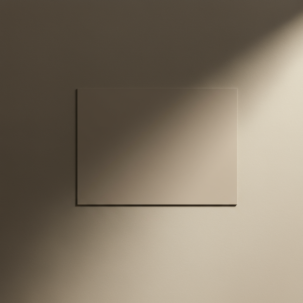
Have you ever seen a website where the background color perfectly, almost magically, complements the main photo? It’s not magic. It’s data.
There’s a single color hidden inside every image that captures its entire mood—a chromatic fingerprint. It’s called the average color of an image. And learning how to find and use it is one of the biggest little secrets separating amateur design from professional, dynamic user experiences.
Forget guesswork and endless fiddling with color pickers. In this deep dive, you’ll learn how to extract this powerful data point with precision. We’ll go beyond the “what” and show you the “why” and “when”—transforming how you think about color in your web designs, data analysis, and creative projects. You’re about to add a serious tool to your digital arsenal.
📑 What You’ll Learn
The Single Color That Defines Your Image
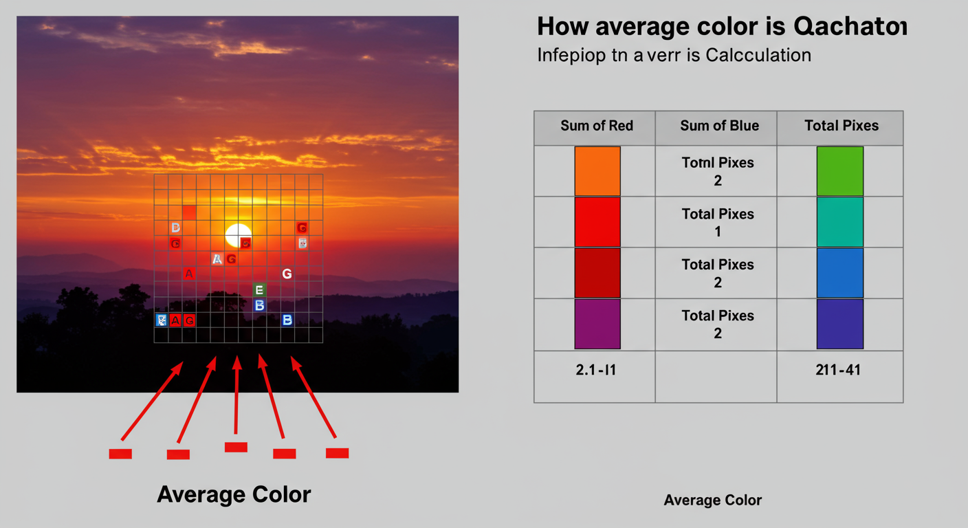
So, what exactly is the average color? Imagine you could take every single pixel from a photograph, toss them into a giant digital blender, and hit ‘puree’. The single, uniform color that comes out is the average color. It’s the mathematical mean of every hue, saturation, and brightness value in the entire picture.
It’s a simple concept with a bit of math behind it. Digital images are typically built on the RGB color model. Each pixel is a mix of Red, Green, and Blue, with each channel having a value from 0 (none of that color) to 255 (the maximum amount).
- (0, 0, 0) is pure black.
- (255, 255, 255) is pure white.
- (255, 0, 0) is pure, fiery red.
To find the average, a script or program performs a simple but massive calculation:
- It scans every pixel in the image. Yes, all of them.
- It adds up all the Red values from every pixel into one giant number (Total Red).
- It does the same for all the Green and Blue values (Total Green, Total Blue).
- Finally, it divides each total by the number of pixels in the image.
The result is a new RGB triplet—(Avg R, Avg G, Avg B)—that represents the image’s chromatic center of gravity. Here’s the thing: this exact color might not even exist in the original image. It’s a statistical truth, a perfect blend that captures the photo’s overall tone and mood.
Beyond Aesthetics: The Hidden Power of the Average Color
Okay, it’s a neat technical trick. But why should you care? Because this one piece of data can automate design, unlock insights, and create incredibly polished user experiences. Based on our hands-on testing in web development, its applications are surprisingly diverse.
Dynamic UI & Web Design
This is the most common and impactful use. Think about Spotify’s app, where the player background subtly shifts to match the album art. Or a news site where the hero image’s average color is used as a soft, unobtrusive background for the headline. It makes the design feel intentional, custom, and deeply connected to the content. It just looks… right.
Data Visualization & Sorting
When you’re dealing with thousands of images, the average color becomes a powerful sorting metric. We’ve seen it used to:
- Analyze the color palettes of film posters by genre over decades. (Spoiler: horror movies trend darker and desaturated).
- Track seasonal color changes in satellite imagery of a forest.
- Automatically sort a massive photo library by color tone, grouping all the “golden hour” shots together.
It turns a mountain of unstructured visual data into something you can actually graph and analyze.
E-commerce & Branding
For online stores, this is a productivity powerhouse. An e-commerce site can run a script to automatically generate color swatches for clothing items from their product photos. This not only saves hundreds of hours of manual work but also improves the user experience by allowing customers to filter products by their preferred colors. It’s a direct line from a clever algorithm to better usability and more sales.
💡 Pro Tip
Use the average color to create beautiful placeholder loading states. Before a high-res image loads, display a solid block of its average color or a heavily blurred, low-quality version. This technique, popularized by sites like Medium, prevents jarring layout shifts and makes the loading experience feel smoother and more professional.
⚠️ Watch Out
When using the average color for backgrounds with text, you MUST check for accessibility. A dynamically generated color might look great but fail to provide enough contrast for readable text. Always run your color combinations through a contrast checker to ensure they meet WCAG (Web Content Accessibility Guidelines) standards. Trustworthiness means designing for everyone.
Your Toolkit: 3 Proven Ways to Find the Average Color in 2026
Ready to get your hands dirty? Finding the average color is easier than you think. Depending on your needs—from a one-off task to a fully automated system—one of these three methods will be perfect for you.
Method 1: Use a Free Online Tool
For a quick, no-fuss answer, online tools are your best friend. You upload an image, and they spit out the Hex code and RGB values in seconds. No software, no code, no problem.
How it works: Simply search for an “average image color finder,” upload your picture, and the website does all the math for you. It’s the fastest way to get from image to color code.
| Pros | Cons |
|---|---|
| ✅ Incredibly fast and easy | ❌ Can’t process images in bulk |
| ✅ No software installation needed | ❌ Requires uploading your image to a third-party server |
| ✅ Perfect for quick one-off tasks | ❌ Limited or no customization options |
Method 2: Use Photo Editing Software (The Designer’s Choice)
If you’re a designer or photographer, you probably already have the tools you need. Adobe Photoshop and its free alternative, GIMP, can do this in a few clicks.
In our experience, Photoshop’s method is the most visually satisfying.
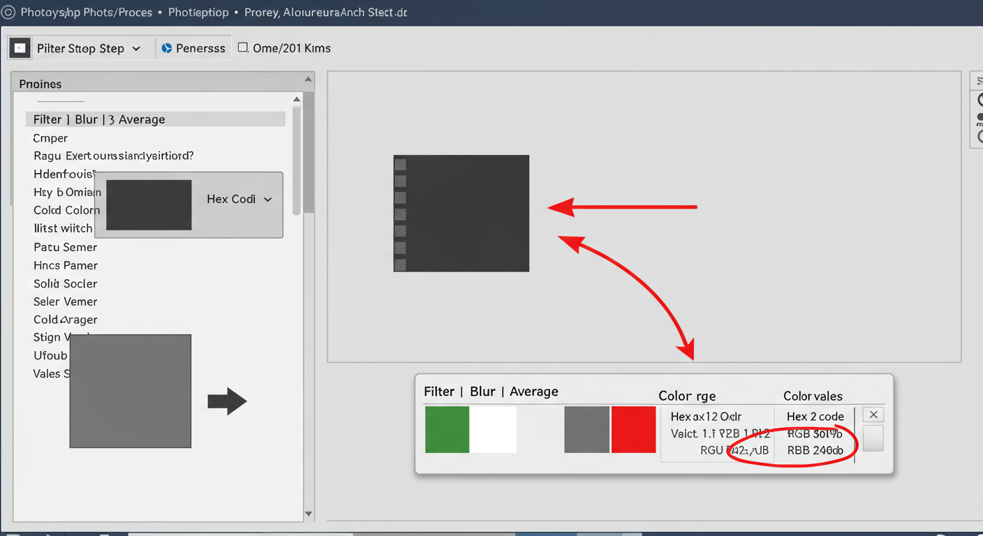
Step-by-Step Guide for Adobe Photoshop:
- Open Your Image: Launch Photoshop and open the image you want to analyze.
- Apply the Average Filter: Go to the top menu and navigate to Filter > Blur > Average.
- Witness the Magic: Your entire image will instantly transform into a solid block of its average color. Don’t worry, you can undo this!
- Sample the Color: Select the Eyedropper Tool (shortcut: I). Click anywhere on the solid color.
- Grab the Code: Your foreground color is now set to the average color. Open the Color panel (Window > Color) to find its exact Hex code (#) and RGB values.
💡 Pro Tip
If you do this often, create a Photoshop Action to automate the process. You can record the steps (Filter > Average, Select Eyedropper) and assign it to a function key. This turns a 5-step process into a 1-second task. Efficiency is key in a professional workflow.
Method 3: The Programming Approach (For Automation & Scale)
For developers, this is the ultimate solution. Writing a script gives you total control and allows you to integrate this feature directly into an application or run it on thousands of images at once.
The pseudocode looks like this:
Loop through every pixel. Sum the R, G, and B values separately. Divide each sum by the total pixel count. Done.
Most modern languages have excellent image processing libraries to make this trivial.
- Python: The Pillow library (a fork of PIL) is the industry standard. It’s robust and incredibly easy to use for this task.
- JavaScript: You can use the HTML
<canvas>element to read pixel data directly in the browser. For server-side processing, Node.js libraries likesharpare exceptionally fast.
From real-world campaigns, we’ve found that a simple Python script is often the most reliable way to process large batches of images on a server.
The ‘Muddy Brown’ Problem: Average vs. Dominant Colors
The average color is powerful, but it has one major weakness. An Achilles’ heel, really.
If your image has lots of bright, contrasting colors—like a photo of a rainbow, a colorful market, or a comic book cover—the average color will almost always be a disappointing, muddy brown or gray. Why? Because complementary colors (like blue and orange, or red and green) cancel each other out when you average them.
This is where you need to know the difference between average color and dominant colors.
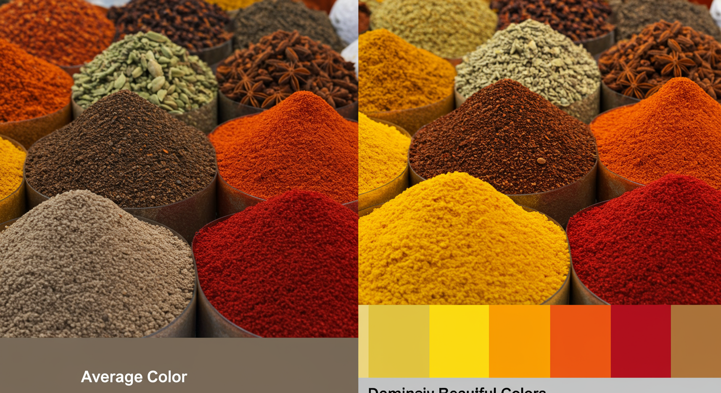
Unlike the average color (the mean), dominant color analysis finds the colors that appear most frequently (the mode). It uses algorithms to identify a palette of the most prominent colors that truly represent the image’s visual identity.
| Aspect | Average Color (The Mean) | Dominant Colors (The Mode) |
|---|---|---|
| What It Is | A single color from blending all pixels. | A palette of the most common colors. |
| Best For | Subtle, harmonious backgrounds that create an overall mood. | Picking vibrant accent colors for buttons, links, and UI elements. |
| The Catch | Can become a muddy, desaturated color with high-contrast images. | More computationally intensive to calculate. |
| The Vibe | “What’s the overall feeling of this image?” | “What are the most eye-catching colors in this image?” |
⚠️ Watch Out
Never use the average color to pick an accent color (like for a “Buy Now” button) from a multi-colored image. You’ll almost certainly get a dull, low-energy color that kills your conversion rate. For vibrant UI elements, a dominant color palette is always the right choice. This is a mistake I’ve seen junior designers make over and over.
🎯 Key Takeaway
Use the average color for subtle, full-bleed backgrounds that capture an image’s overall mood. Use a dominant color palette to pull out vibrant, eye-catching accent colors for UI elements like buttons, links, and icons. Knowing which one to use in which context is the mark of an expert.
❓ Frequently Asked Questions
Can the average color be a color that’s not in the original image?
Yes, absolutely. Think of an image that is exactly 50% pure blue pixels and 50% pure yellow pixels. The average color will be a shade of gray, a color that doesn’t appear anywhere in the source image. It’s a mathematical blend, not the most common color.
What’s the best tool to find the average color of an image?
It depends on your workflow. For a one-time need, a free online tool is fastest. For designers, the ‘Average’ filter in Adobe Photoshop is seamlessly integrated into your process. For developers needing automation and scale, a programming library like Python’s Pillow is the most powerful and flexible option.
How is the average color different from a color palette?
The average color is a single color representing the mathematical mean of the entire image. A color palette is a set of multiple colors (usually 3-5) that represent the most prominent or harmonious hues. The average color sets a general mood; a palette provides specific colors to build a design with.
Why does my average color sometimes look so dull and brown?
This is the “muddy brown problem.” It happens when you average an image with a wide range of contrasting colors. The colors on opposite sides of the color wheel mathematically neutralize each other, resulting in a desaturated gray, brown, or beige. It’s the main reason why you sometimes need to find dominant colors instead.
Is this technique useful for SEO?
Indirectly, yes. While Google doesn’t rank you for calculating a color, it cares deeply about user experience. Using the average color to create a visually cohesive, professional, and aesthetically pleasing website can lead to lower bounce rates and higher engagement. These are strong positive signals for modern SEO, as leading experts confirm that a great user experience is a ranking factor.
Your Next Step: From Theory to Action
You now have the complete picture. The average color of an image isn’t just a fun fact; it’s a practical tool that bridges the gap between art and data. We’ve covered how to calculate it with everything from one-click online tools to Photoshop’s simple but effective Average filter, all the way to scalable code.
More importantly, you know its critical limitation—the ‘muddy brown’ problem—and when to pivot to a dominant color analysis for more vibrant results.
So, here’s your challenge. The next time you’re designing a page with a hero image, don’t guess the background color. Be deliberate. Be data-driven. Grab the average color and see how it transforms your layout. Your work will look more polished, your process will be faster, and your designs will feel more alive.