You’ve spent a fortune on a gorgeous website. The design is sleek, the copy is compelling, and you’re ready for the leads to pour in. But there’s a silent killer lurking in your media library, and it’s strangling your performance: your images.
I see it all the time. A business owner uploads a stunning, 5MB photo straight from their professional camera to their homepage. On their big desktop monitor, it looks incredible. But for a user on a smartphone, it’s a disaster. The browser strains to download and shrink that massive file, the page takes forever to load, and the potential customer gets frustrated and leaves. Just like that, a sale is lost.
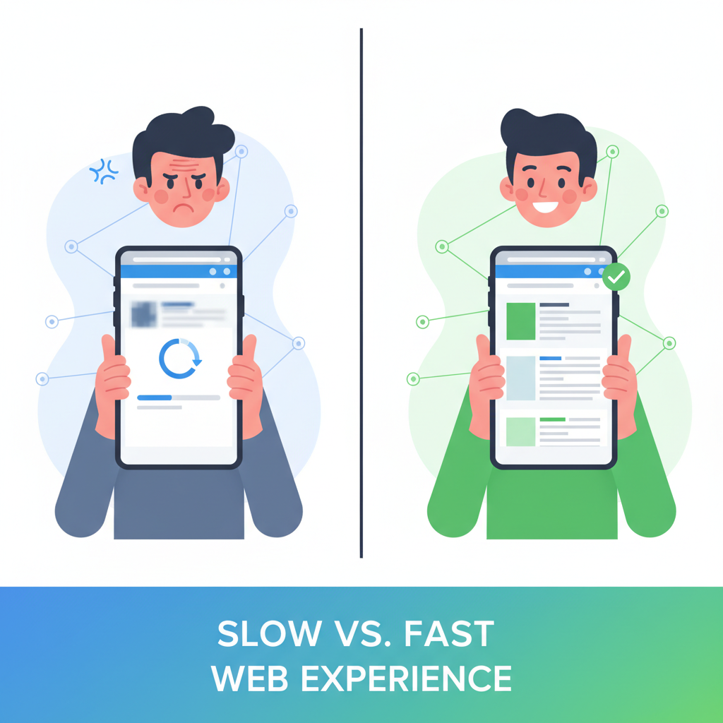
This isn’t just a minor technical hiccup; it’s a direct assault on your user experience, your SEO, and your bottom line. And the single most effective weapon against this performance-killing problem is something surprisingly simple: a good image resizer tool.
Forget everything you think you know about image optimization being some dark art reserved for developers. In my 20+ years of building websites that dominate search results, I’ve learned that mastering the fundamentals is what truly moves the needle. And resizing your images *before* you upload them is arguably the most fundamental—and most overlooked—step of all. This guide isn’t just about clicking a button; it’s a deep dive into the strategy behind making your visuals work *for* you, not against you. We’ll cover the why, the how, and the critical mistakes to avoid.
The Silent Killer of Conversions: Why Unresized Images Are Costing You Money
Let’s be honest. When we talk about “page speed,” it can sound like a vague, technical term. But what we’re really talking about is money. Every millisecond your site takes to load has a measurable impact on your ability to convert visitors into customers.
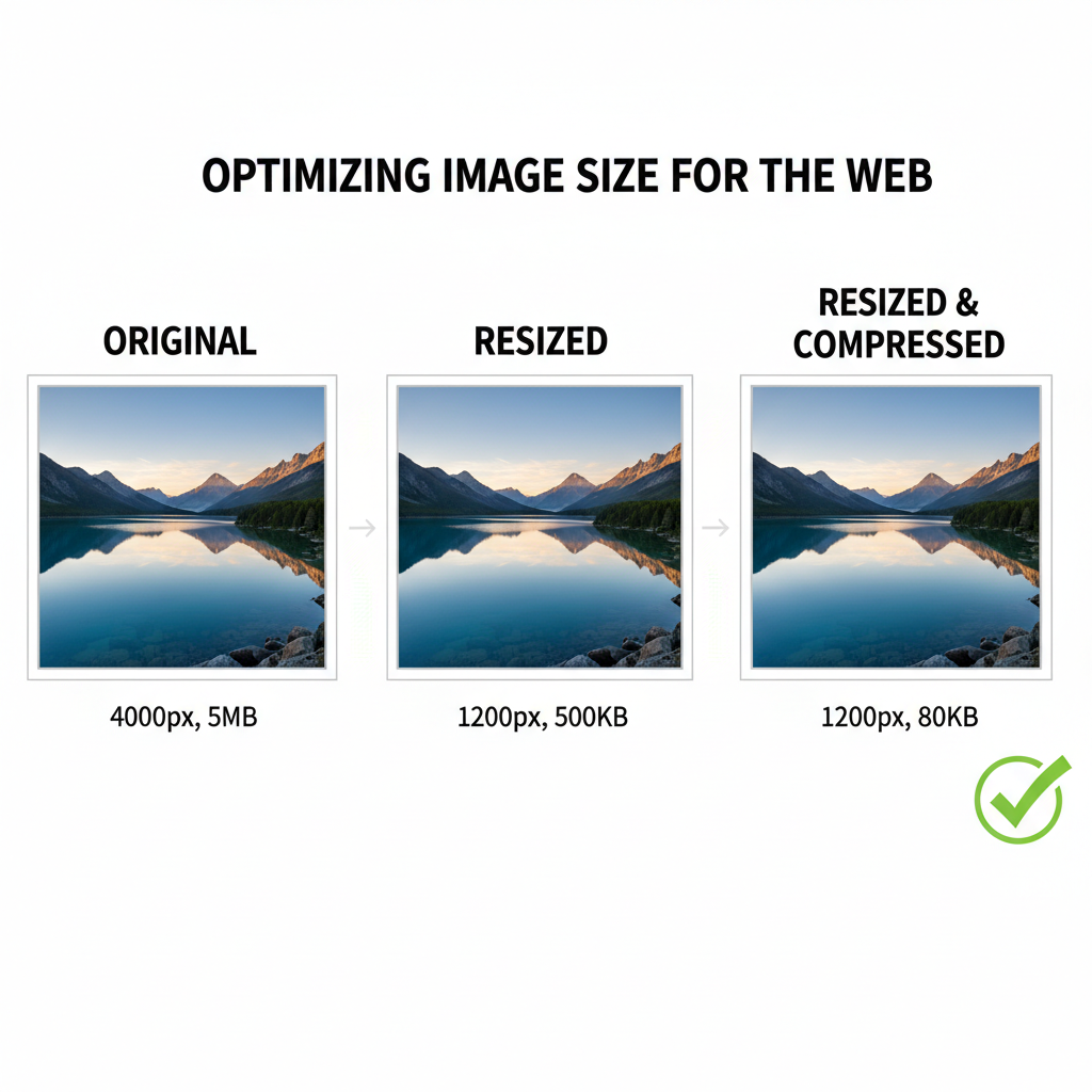
Think of it this way: uploading a 4000-pixel wide image for a space that only needs to be 800 pixels wide is like trying to shove a king-size mattress through a standard doorway. It’s inefficient, clumsy, and creates a massive bottleneck. The browser has to download the entire oversized file and then use precious processing power to scale it down. This is a primary cause of slow load times.
The data doesn’t lie:
According to research from Deloitte, a mere 0.1-second improvement in site speed can boost conversion rates by 8%. For a site doing significant revenue, that’s a massive return from a simple optimization.
Google has made it crystal clear that user experience is a top-ranking factor. Their Core Web Vitals (CWV) are a set of metrics that measure real-world user experience for loading performance, interactivity, and visual stability. And guess what the biggest offender for a poor Largest Contentful Paint (LCP) score is? That’s right: large, unoptimized images.
- Largest Contentful Paint (LCP): This measures how long it takes for the largest element on the screen (usually a hero image or banner) to become visible. A huge, unresized image can push your LCP into the “poor” category, directly harming your rankings.
- Cumulative Layout Shift (CLS): If you don’t specify image dimensions, the browser doesn’t know how much space to save. As the image finally loads, it can cause the whole page layout to jump around—a frustrating experience that Google penalizes. Resizing helps you define these dimensions properly.
By using an image resizer tool, you are taking direct control of these factors. You serve the browser the exact dimensions it needs, which means a smaller file size, a faster download, and a much better LCP score. It’s one of the highest-impact SEO tasks you can perform, and it takes just a few seconds per image.
Resizing vs. Compression vs. Cropping: The Ultimate Showdown
Before we go any further, we need to clear up some common confusion. I often hear people use the terms “resizing,” “compressing,” and “cropping” interchangeably, but they are three distinct processes. Understanding the difference is crucial to building an effective image optimization workflow.
Here’s a simple breakdown:
| Action | What It Does | Primary Goal | Analogy |
|---|---|---|---|
| Cropping | Cuts away parts of the image, changing its composition and aspect ratio. | Improve focus and composition. | Framing a photograph. |
| Resizing | Changes the pixel dimensions (width and height) of the entire image. | Match the display size requirements of your website. | Tailoring a suit to fit perfectly. |
| Compressing | Reduces the file size (in KB or MB) by removing redundant data, without changing dimensions. | Decrease load time and save bandwidth. | Vacuum-packing clothes for a suitcase. |
An image resizer tool is your tailor. It ensures the image is the perfect size for the space it will occupy. Compression is the final step to make that perfectly-sized image as lightweight as possible. You need both, but resizing always comes first.
My Proven 5-Step Workflow for Using an Image Resizer Tool
Over the years, I’ve refined my image optimization process down to a simple, repeatable workflow. Following these steps will ensure your images are perfectly sized and high-quality every single time.
Step 1: The Blueprint – Determine Your Target Dimensions
Never open an image resizer tool without knowing your goal. You need to know the maximum width your image will be displayed at on your website. You can find this by using your browser’s ‘Inspect’ tool on your website’s content area. Here’s a general cheat sheet:
- Full-width Hero Image: 1920px wide
- Main Blog Content Width: 800px – 1200px wide (depending on your theme)
- Sidebar Image: ~300px wide
- E-commerce Product Image: 800px – 1000px wide
- Thumbnail/Avatar: 150px – 300px wide
Knowing this number is your first and most critical step.
Step 2: The Right Tool for the Job
There are countless tools available, from powerful desktop software to simple online apps. You don’t need to overthink it.
- Online Tools (like ToolsRiver): Perfect for quick, one-off resizing. You just upload, enter your dimensions, and download. They are fast, free, and accessible from anywhere.
- Desktop Software (Photoshop, GIMP): Offer more control, batch processing features, and advanced options for quality. Best for professionals who handle many images.
- CMS Plugins (e.g., for WordPress): These can automate resizing on upload, but it’s still best practice to resize *before* uploading to save server resources.
Step 3: The Golden Rule – Lock the Aspect Ratio
This is non-negotiable. The aspect ratio is the proportional relationship between an image’s width and height. If you change one dimension without proportionally changing the other, you get a stretched or squashed image. It looks unprofessional and instantly destroys credibility. Every good image resizer tool will have a checkbox or a chain-link icon labeled “Maintain aspect ratio” or “Lock aspect ratio.” Always make sure it’s enabled. Then, just enter your target width from Step 1, and the height will adjust automatically.
Step 4: The Format Face-Off – Choosing JPEG, PNG, or WebP
The file format you choose has a massive impact on quality and file size. Before or during resizing, make sure you’re using the right one.
- JPEG: Your go-to for all standard photographs. It provides excellent compression for images with millions of colors.
- PNG: Use this *only* when you need a transparent background (like for a logo or an icon). PNG files are often much larger than JPEGs for photographic content.
- WebP: The modern champion. Developed by Google, WebP offers significantly smaller file sizes than JPEG and PNG at comparable quality, and it supports transparency. According to Google, WebP images are, on average, 26% smaller than PNGs and 25-34% smaller than JPEGs. Most modern browsers support it, and it should be your default choice if possible.
Step 5: The Final Polish – Compression & SEO-Friendly Naming
After you’ve downloaded your perfectly resized image, run it through a compression tool (like TinyPNG or ImageOptim) to squeeze out extra kilobytes without sacrificing noticeable quality. Finally, rename the file before uploading. Instead of `IMG_8472.jpg`, name it something descriptive that includes your target keyword, like `using-image-resizer-tool-workflow.jpg`. This gives Google another small clue about your page’s content.
The Biggest Mistakes I See People Make (And How to Avoid Them)
Using an image resizer tool seems simple, but there are a few common pitfalls that can trip people up and negate all their hard work. Here’s what to watch out for.
Mistake #1: Forgetting About Retina Displays
Many modern devices (laptops, tablets, phones) have high-resolution “Retina” screens. These screens pack twice as many pixels into the same physical space. To make images look sharp on these displays, you need to provide an image that is twice the size of its container.
Mistake #2: Ignoring the Aspect Ratio (The Distortion Disaster)
I mentioned this before, but it’s worth repeating. If you need a square image for a profile picture but your source photo is a rectangle, do not just type `500` x `500` into the resizer. This will squash the image. The correct process is to crop the image to a square first, and *then* resize that new square image to your final dimensions.
Mistake #3: Relying Solely on a CMS Plugin
While image optimization plugins for WordPress are incredibly useful, they aren’t a magic bullet. Many of them work by compressing images *after* you’ve uploaded them. The problem? You’ve still uploaded the massive original file, which consumes your server’s bandwidth and storage space. A plugin should be your safety net, not your primary strategy. The best practice is always to resize and compress *before* hitting that upload button.
Beyond Your Website: Using an Image Resizer Tool for Social Media
Your image strategy doesn’t end on your website. Each social media platform has its own set of optimal image dimensions. Have you ever uploaded a beautiful photo to Facebook only to have it look blurry and artifacted? That’s because if you upload an oversized image, the platform’s aggressive, one-size-fits-all compression algorithm takes over and butchers your quality.
By using an image resizer tool to create specific versions for each platform, you retain control. You’re giving the platform a file that’s already perfect, so its algorithm does minimal damage. This makes your brand look more professional and polished.
Updated Image Dimensions for 2024:
- Instagram Feed Post (Square): 1080 x 1080 pixels
- Instagram Stories / Reels: 1080 x 1920 pixels
- Facebook / LinkedIn Shared Link Image: 1200 x 630 pixels
- X (Twitter) In-Stream Photo: 1600 x 900 pixels
- Pinterest Pin (2:3 Ratio): 1000 x 1500 pixels
Taking a few extra minutes to resize for each platform shows an attention to detail that sets you apart from the competition.
Advanced Tactics: Batch Processing and Automation
If you’re managing an e-commerce store with hundreds of product photos or a blog where you publish daily, resizing images one by one is a nightmare. This is where batch processing comes in. Many tools allow you to apply the same resizing action to an entire folder of images at once.
- Desktop Tools: Adobe Photoshop and Lightroom have powerful “Actions” and “Export Presets” that let you define a resizing and compression recipe and apply it to hundreds of photos with a single click.
- Online Batch Resizers: Several online tools now offer the ability to drag and drop a whole group of images and resize them to a uniform width simultaneously.
- For the Developers (The Ultimate Automation): Tools like ImageMagick (a command-line tool) or cloud-based image processing APIs (like Cloudinary or Imgix) can integrate directly into your website’s backend. They can automatically resize, compress, and even change formats on the fly, serving the perfectly optimized image for every single user and device. This is the enterprise-grade solution for maximum performance.
Just as you’d learn how to use a password generator for security to automate creating strong passwords, learning to batch process images automates a critical part of your site’s performance security.
Your Images Are Assets, Not Afterthoughts
At the end of the day, using an image resizer tool is not just about checking a box on an SEO checklist. It’s about respecting your user’s time and your own server resources. It’s a fundamental practice that separates professional, high-performing websites from slow, amateurish ones.
By taking control of your image dimensions, you directly influence your site’s speed, user experience, and Google ranking. It’s one of the few optimizations that is 100% within your control, requires no budget, and delivers immediate, measurable results. Stop letting oversized images sabotage your success. Start resizing today and watch your performance metrics—and your conversions—climb.
Need to resize a video thumbnail for your social media? Don’t forget you can use other tools for tasks like downloading high-quality thumbnails before you resize them for other platforms.