Here’s the cold, hard truth: nobody waits for a slow website. In fact, Google’s data suggests that 53% of mobile site visits are abandoned if a page takes longer than three seconds to load. Three seconds. That’s all you get.
So, what’s the number one culprit killing your load speeds? It’s not your code, and it’s usually not your server. It’s your images.
We’ve all been there. You take a stunning photo with your smartphone or download a high-res stock image, and you upload it directly to your blog or e-commerce store. It looks great, sure. But behind the scenes, that 5MB file is acting like a digital anchor, dragging your SEO rankings down into the abyss.
This is where a professional image resizer tool becomes your secret weapon. It’s not just about cropping a picture; it’s about surgical precision—balancing visual fidelity with technical performance. In my years managing content strategies for high-traffic sites, I’ve seen simple image optimization campaigns double organic traffic in a matter of months.
In this guide, we aren’t just going to talk about making pictures smaller. We’re going to cover how to use resizing to dominate Core Web Vitals, improve user experience (UX), and ultimately, make your website more profitable.
📑 What You’ll Learn
The Hidden Cost of Unoptimized Images
Let’s get technical for a moment. When a browser loads your webpage, it has to download every byte of data before it can fully render the content. If you upload a raw image that is 4000 pixels wide, but your website’s content area is only 800 pixels wide, you are forcing the user’s browser to download wasted data.
It’s like trying to fill a shot glass with a firehose. It’s messy, inefficient, and wasteful.
From a user experience perspective, this “page bloat” is disastrous. Large files cause layout shifts (where text jumps around as images load), which is incredibly frustrating for readers. Google measures this via a metric called Cumulative Layout Shift (CLS). If your CLS score is poor, your rankings suffer. It’s that simple.
Using an image resizer tool allows you to serve the exact dimensions the browser needs. This reduces the strain on mobile networks and ensures your site feels snappy, even on a 4G connection.
How Image Resizing Impacts Google Rankings
You might be thinking, “Does Google really care if my image is 1000px or 2000px?” The answer is a resounding yes.
Since the introduction of Core Web Vitals, Google has made page experience a direct ranking factor. One of the most critical metrics is Largest Contentful Paint (LCP). This measures how long it takes for the main content of your page (often the hero image) to load.
If you don’t resize your images, your LCP score tanks. I’ve seen client sites move from page 2 to page 1 simply by resizing their hero banners and product thumbnails.
🎯 Key Takeaway
An image resizer tool isn’t just a design utility; it is a primary SEO tool. By matching image dimensions to your display size, you directly improve LCP and CLS scores, signaling to Google that your site is high-quality and worthy of ranking.
The Data: Raw vs. Optimized
Let’s look at a real-world scenario. We took a standard stock photo and tested its impact on load time before and after using an image resizer tool.
| Metric | Raw Upload (Original) | Optimized (Resized & Compressed) | Performance Gain |
|---|---|---|---|
| Dimensions | 4032 x 3024 px | 800 x 600 px | N/A (Fit to screen) |
| File Size | 4.2 MB | 68 KB | 98% Reduction |
| Load Time (3G) | ~14.5 Seconds | ~0.6 Seconds | 24x Faster |
| Google LCP Score | Poor (Red) | Good (Green) | SEO Boost |
The numbers don’t lie. That 98% reduction in file size is the difference between a user reading your content or hitting the “back” button.
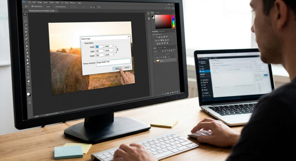
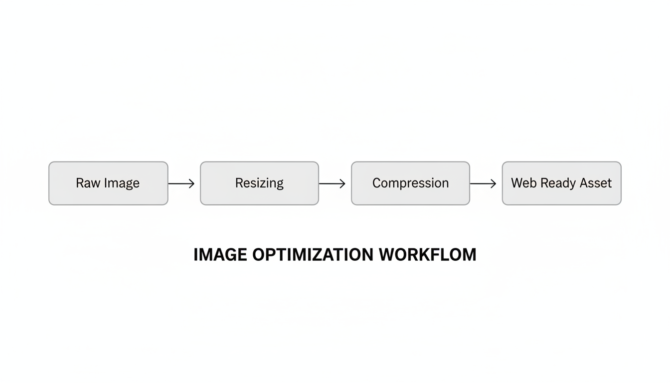
Step-by-Step: The Perfect Resizing Workflow
Using an image resizer tool effectively requires a bit of strategy. You don’t want to just guess. Here is the exact workflow I use for premium content production.
- Identify Your Container Width: Right-click on your blog post or product page and choose “Inspect.” Hover over the content area to see the pixel width. For most blogs, this is between 700px and 850px.
- Resize to Target Dimensions: Use your tool to scale the image down to that exact width. If you want to support Retina (high-density) displays, you can double that number (e.g., 1600px), but be careful with file size.
- Lock Aspect Ratio: Always ensure the width and height are linked. If you change width without changing height, your image will look stretched and amateurish.
- Choose the Right Format:
- JPEG/JPG: Best for photographs, people, and complex scenes.
- PNG: Best for screenshots, logos, and images with text or transparent backgrounds.
- WebP: The modern standard. If your tool supports exporting to WebP, do it. It offers superior compression.
- Compress After Resizing: Once the dimensions are correct, run the image through a compression algorithm to strip unnecessary metadata.
💡 Pro Tip
Don’t rely on CSS to resize images. If you upload a 2000px image and use HTML code to display it at 500px (width="500"), the browser still downloads the full 2000px file. Always resize the actual file before uploading.
3 Fatal Mistakes to Avoid
Even experienced marketers mess this up. I’ve audited sites where the content was brilliant, but the image strategy was sabotaging their success. Watch out for these traps.
1. Upscaling Low-Res Images
An image resizer tool is magic, but it can’t create data that isn’t there. If you take a tiny 200px thumbnail and try to blow it up to 1000px, it will look pixelated, blurry, and cheap. This destroys trust. If an image is too small, find a new source; don’t force it.
2. Ignoring the “Save for Web” Settings
Many people resize but forget to strip the metadata. Your camera stores GPS data, shutter speed info, and thumbnail previews inside the image file. This adds “invisible weight.” A good tool strips this out automatically.
3. Inconsistent Aspect Ratios
Especially for e-commerce, having one product image square and the next rectangular makes your store look chaotic. Decide on a standard ratio (e.g., 1:1 square or 4:3 landscape) and stick to it for every single upload.
⚠️ Watch Out
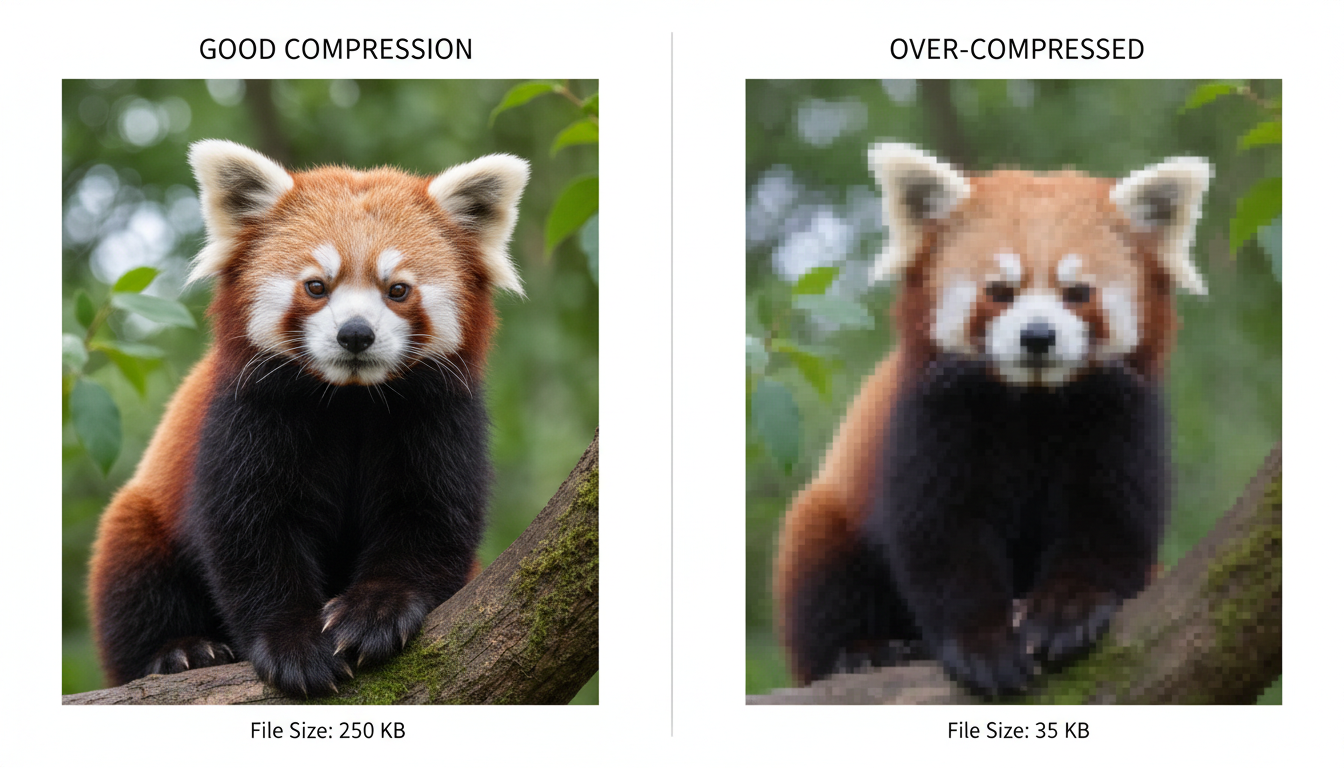
Be careful with aggressive compression. If you reduce the quality setting below 60-70%, you might start seeing “artifacts” (weird blocky noise) in your images. Always preview the image before saving to ensure it still looks crisp.
Cheat Sheet: Social Media Dimensions
Social media platforms are notorious for ruining image quality. If you upload the wrong size, their algorithms will brutally compress and crop your image, often cutting off text or making faces look muddy.
Control the narrative by resizing your assets specifically for each platform before you post.
| Platform | Image Type | Recommended Dimensions | Aspect Ratio |
|---|---|---|---|
| Feed Post | 1080 x 1080 px | 1:1 (Square) | |
| Story / Reel | 1080 x 1920 px | 9:16 (Vertical) | |
| Shared Link | 1200 x 630 px | 1.91:1 | |
| Standard Pin | 1000 x 1500 px | 2:3 | |
| Post Image | 1200 x 627 px | 1.91:1 |
By adhering to these standards, you ensure your brand looks professional across the web. For a deeper dive into platform-specific requirements, Sprout Social’s always-updated guide is an excellent resource.
Pixels vs. DPI: A Technical Deep Dive
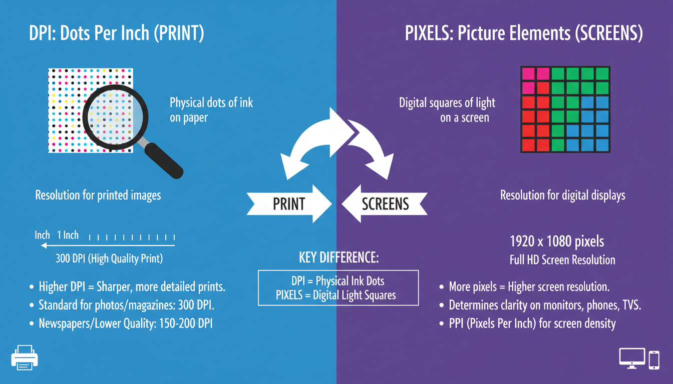
Here is where a lot of people get confused. You might hear photographers talk about “300 DPI” (Dots Per Inch) for high quality.
Here is the thing: DPI does not matter for the web.
Screens display images based on pixel dimensions, not dot density. A 1000px wide image at 72 DPI looks exactly the same on a screen as a 1000px wide image at 300 DPI. The only difference is the metadata tag.
However, file size does change if the dimensions change. When using an image resizer tool, ignore the DPI setting and focus entirely on the pixel width and height. According to MDN Web Docs, understanding the distinction between raster (pixels) and vector (math-based) graphics is fundamental to modern web design.
💡 Pro Tip
If you are resizing screenshots containing text, avoid JPEG. The compression often makes text look “fuzzy” around the edges. Switch to PNG format for crisp, readable text overlays.
Frequently Asked Questions
❓ Frequently Asked Questions
Does resizing an image reduce its quality?
If you are scaling down (e.g., from 2000px to 800px), the visual quality usually remains excellent, and the image often looks sharper on screens. However, scaling up (making a small image larger) will always result in pixelation and quality loss.
What is the best file format for web images?
For general photography, WebP is currently the best balance of quality and file size, supported by all modern browsers. JPEG is a solid runner-up. Use PNG only for graphics requiring transparency.
How does image resizing affect mobile users?
It’s critical. Mobile devices often rely on cellular data. Downloading massive images drains data plans and battery life. Properly resized images load instantly, keeping mobile users happy and reducing bounce rates.
Can I just use a WordPress plugin to resize images?
Plugins are great, but they use your server’s resources to process images, which can slow down your site during the upload process. Pre-resizing images with a dedicated tool before uploading is often the safer, more performance-friendly method.
What is the standard width for a blog post image?
While it depends on your specific theme, a width of 1200 pixels is a safe standard for full-width featured images. For images inside the body of the post, 800 pixels is usually sufficient.
Conclusion: Make Resizing a Habit, Not an Afterthought
In the digital world, every kilobyte counts. An image resizer tool is deceptively simple, but it bridges the gap between high-quality aesthetics and high-performance technical requirements. It’s the difference between a site that feels professional and one that feels neglected.
Don’t let large files drag down your digital potential. Start integrating this simple step into your workflow today. Your server will thank you, your SEO rankings will improve, and most importantly, your visitors will stick around long enough to see what you have to offer.
Ready to optimize? Start by auditing your top 10 most popular pages and resizing the images there first. You’ll likely see a performance bump in Google PageSpeed Insights almost immediately.