Why Every Designer Needs a Reliable Color Palette Generator
In the vast world of visual communication, color is often the first thing a person notices. It sets the mood, conveys emotion, and establishes a brand’s identity before a single word is read. However, finding the perfect combination of hues isn’t always easy. This is where a color palette generator becomes an indispensable asset for designers, marketers, and creative professionals. By using these tools, you can move beyond guesswork and rely on mathematical harmony and color theory to create visually stunning results.
Whether you are a seasoned professional or a beginner, a color palette generator helps streamline your workflow. It allows you to explore thousands of color combinations in seconds, ensuring that your project remains cohesive and professional. In this guide, we will dive deep into how these tools work, the psychology behind color choices, and how you can leverage them to elevate your design projects to the next level.
Efficiency
A generator saves hours of manual experimentation by providing instant, harmonious suggestions based on your initial input or a random seed.
Consistency
Using a tool ensures that you have exact HEX, RGB, and CMYK codes, maintaining brand consistency across digital and print media.
Accessibility
Modern tools often include contrast checkers, helping you design websites and apps that are readable for users with visual impairments.
Inspiration
When you’re stuck in a creative rut, a generator can introduce you to unexpected color pairings that you might not have considered otherwise.
How a Color Palette Generator Simplifies the Branding Process
Branding is more than just a logo; it is the emotional connection a company makes with its audience. The colors you choose play a pivotal role in this connection. When you use a color palette generator for branding, you are ensuring that the primary, secondary, and accent colors work together to tell a unified story. For instance, a tech startup might want to convey trust and innovation, while a bakery might aim for warmth and comfort.
A well-structured palette usually consists of a dominant color, a secondary color, and one or two accent colors. Many designers also include neutral tones like grays or off-whites to balance the more vibrant shades. By inputting your primary brand color into a tool, you can instantly see how different variations—such as monochromatic or complementary schemes—look in real-time. This process is essential for creating a brand style guide that can be easily followed by other team members.
Just as a scatter plot generator helps you visualize data relationships, a color tool helps you visualize the relationship between different emotional triggers and visual elements. This clarity is vital when presenting design concepts to clients who may not have a background in art but know what they like when they see it.
Understanding Color Harmony Through a Color Palette Generator
Color harmony is the heart of any successful design. It refers to the arrangement of colors in a way that is pleasing to the eye. Most color palette generator tools are built upon the principles of the color wheel, first developed by Isaac Newton. Understanding these harmonies allows you to manipulate the tool more effectively.
- Complementary: Colors located opposite each other on the wheel. They provide high contrast and high energy.
- Analogous: Colors located next to each other. They often match well and create serene, comfortable designs.
- Triadic: Three colors evenly spaced around the wheel. This creates a vibrant look even if you use pale or unsaturated versions of your hues.
- Monochromatic: Different shades, tints, and tones of a single color. This is excellent for clean, sophisticated, and minimalist designs.
Red: Excitement & Urgency
Often used in food industries and clearance sales to grab attention and stimulate appetite or action.
Blue: Trust & Security
The go-to choice for financial institutions and tech companies looking to build a sense of reliability.
Green: Growth & Health
Perfect for eco-friendly brands, wellness products, and finance apps representing wealth growth.
Yellow: Optimism & Warmth
A cheerful color that can be used to highlight important information or evoke a sense of happiness.
Top Features to Look for in a Modern Color Palette Generator
Not all tools are created equal. When searching for the best color palette generator, you should look for specific features that cater to modern design needs. One of the most important features is the ability to extract colors from an image. This allows you to upload a photo that matches the “vibe” of your project and generate a palette based on its natural colors. This is particularly useful for interior designers or photographers who want to maintain a specific mood.
Another critical feature is the export capability. A professional tool should allow you to export your palette in various formats like CSS, SCSS, PDF, or even as an Adobe Swatch file. This ensures that you can jump straight into your design software without manually typing in HEX codes. Furthermore, look for tools that offer “shades” and “tints” generators. This gives you more flexibility by providing lighter and darker versions of your chosen colors, which is essential for UI elements like buttons and hover states.
According to experts at the Interaction Design Foundation, the use of color in user interface design must also account for visual hierarchy. A good generator will help you pick colors that naturally guide the user’s eye toward the most important elements on a page.
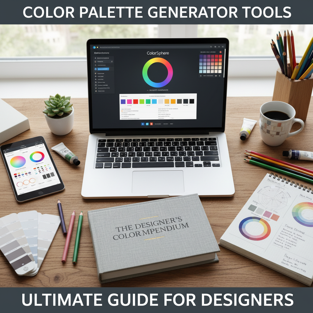
Maximizing Creativity with the Tools River Color Palette Generator
For those looking for a seamless and intuitive experience, the Tools River Color Palette Generator is an excellent choice. This tool is designed with both simplicity and power in mind. It allows users to generate unique color schemes with a single click, making it perfect for rapid prototyping. Whether you are working on a new website layout or a social media campaign, this tool provides the foundational colors you need to succeed.
One of the standout features of the Tools River tool is its clean interface. You don’t get bogged down by unnecessary menus; instead, you can focus on the visual impact of the colors. It is particularly useful for creators who also use tools like the YouTube description extractor to manage their digital presence, as consistency across all platforms—from your video branding to your website UI—is key to building a loyal audience.
Using a Color Palette Generator for Better Web Accessibility
In today’s digital landscape, accessibility is not just a “nice-to-have”—it is a requirement. A color palette generator helps you ensure that your text is readable against your background colors. The Web Content Accessibility Guidelines (WCAG) specify contrast ratios that must be met to ensure users with low vision can navigate your site. Many high-end generators now include a built-in contrast checker that gives you a pass/fail grade based on these standards. By integrating this into your workflow early on, you avoid costly redesigns later and ensure your content is inclusive for everyone.
Implementing Your New Color Palette Generator Results into Designs
Once you have used your color palette generator to find the perfect set of colors, the next step is implementation. In web design, this usually involves setting up CSS variables. This allows you to change the color scheme of an entire website by updating just a few lines of code. For marketing materials, such as flyers or social media posts, you should apply the 60-30-10 rule. This rule suggests that 60% of your design should be the dominant color (usually a neutral), 30% should be the secondary color, and 10% should be the accent color for call-to-action buttons or highlights.
As noted in Smashing Magazine, the context of your color usage is just as important as the colors themselves. A bright red might mean “danger” in a cockpit interface, but it means “love” or “excitement” on a Valentine’s Day card. Always consider the cultural and situational context of your audience when applying the results from your generator.
Step 1: Define the Mood
Before opening the tool, decide if your project should feel energetic, professional, or calming.
Step 2: Generate & Lock
Generate a palette and ‘lock’ the colors you love while reshuffling the others until you find a match.
Step 3: Test Accessibility
Check the contrast between your primary text color and background color to ensure readability.
Step 4: Apply the 60-30-10 Rule
Distribute your colors throughout your design using this classic ratio for a balanced look.
In conclusion, a color palette generator is more than just a convenience; it is a fundamental tool for modern design. It bridges the gap between artistic intuition and scientific precision. By understanding color theory, utilizing the right features, and following accessibility standards, you can create designs that are not only beautiful but also functional and impactful. Start experimenting with different schemes today and see how the right colors can transform your creative projects.
FAQs
It is a digital tool that helps designers create harmonious color schemes by using algorithms based on color theory, such as complementary, triadic, or analogous relationships.
Most professional brand palettes consist of 3 to 5 colors: a primary brand color, one or two secondary colors, and a couple of neutral tones for balance.
Yes, many generators allow you to upload an image or enter a specific HEX code to build a surrounding palette that complements your existing logo.
Color contrast ensures that text is legible against its background, which is crucial for accessibility and providing a good user experience for everyone, including those with visual impairments.
Many online color palette generators, including the one at Tools River, are free to use and offer comprehensive features for both hobbyists and professional designers.