Professional Gauge Chart Generator
Create stunning gauge charts and dial meters for KPI dashboards, performance monitoring, and progress visualization with professional styling.
Gauge Configuration
Professional Gauge Chart Generator - Master KPI Visualization and Performance Monitoring
Transform your key performance indicators into compelling visual displays with our comprehensive gauge chart generator designed for dashboard creation, performance monitoring, and progress tracking. Gauge charts, also known as dial charts or speedometer charts, represent one of the most intuitive and immediately understandable visualization formats for displaying single-value metrics against defined targets or ranges. Our advanced generator combines sophisticated design principles with flexible customization options to create professional-quality gauges that enhance decision-making processes and performance communication across organizations.
Unlike static measurement displays, our gauge chart generator provides dynamic, interactive capabilities that adapt to various performance measurement frameworks and organizational requirements. Whether you're monitoring sales performance against targets, tracking customer satisfaction scores, displaying system performance metrics, or presenting project completion percentages, our tool delivers visually compelling results that make complex performance data immediately accessible to stakeholders at all organizational levels.
Advanced Gauge Design and Customization Features
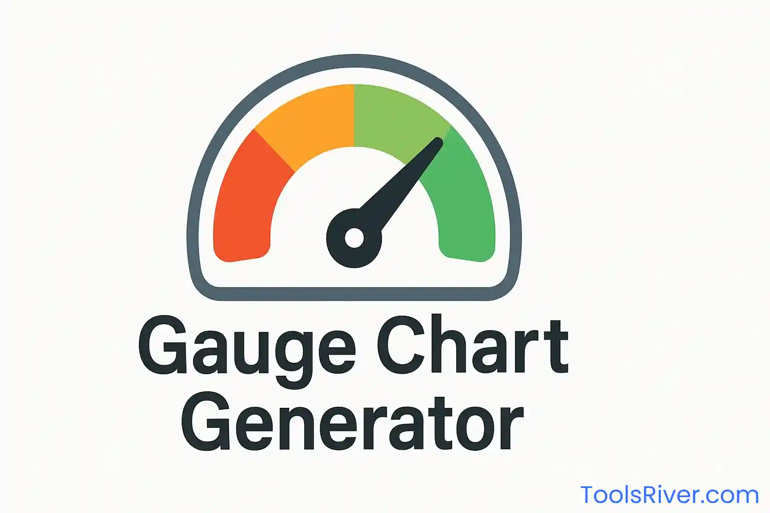
Our gauge chart generator incorporates cutting-edge visualization technologies that provide unparalleled design flexibility and professional presentation capabilities. The multi-style gauge options support various analytical contexts, from traditional speedometer designs perfect for automotive-inspired dashboards to elegant semi-circular displays suitable for executive presentations and compact arch designs optimal for space-constrained dashboard environments.
The intelligent color scheme system goes beyond basic aesthetics to incorporate performance psychology and accessibility standards. The traffic light color scheme provides immediate performance interpretation using universally understood red-yellow-green indicators, while gradient options offer sophisticated visual appeal for modern dashboard designs. Each color scheme is carefully calibrated to ensure optimal contrast ratios and accessibility compliance while maintaining the visual impact necessary for effective performance communication.
Threshold management capabilities enable precise performance zone definition that aligns with organizational standards and industry benchmarks. The flexible threshold system supports custom performance ranges that reflect specific business requirements, whether you're measuring against industry standards, internal targets, or regulatory compliance requirements. This adaptability ensures that your gauges provide meaningful performance context rather than arbitrary visual displays.
Business Intelligence and Dashboard Applications
Gauge charts excel in business intelligence environments where immediate performance assessment is crucial for operational decision-making and strategic planning. Executive dashboards leverage gauge visualizations to display key performance indicators such as revenue achievement, customer satisfaction scores, operational efficiency metrics, and strategic goal progress. The immediate visual feedback provided by gauge charts enables rapid performance assessment and exception identification that supports agile management approaches.
Sales and marketing organizations utilize gauge charts extensively for performance tracking, quota achievement monitoring, and campaign effectiveness measurement. The intuitive visual format makes it easy for sales teams to understand their progress against targets while providing managers with quick visual assessments of team and individual performance across multiple metrics simultaneously.
Operations management applications include manufacturing efficiency monitoring, quality control displays, service level tracking, and safety performance measurement. The real-time visual feedback provided by gauge charts helps operations teams maintain awareness of critical performance indicators while enabling rapid response to performance variations that require immediate attention.
Financial services organizations implement gauge charts for risk monitoring, compliance tracking, portfolio performance display, and client satisfaction measurement. The professional presentation format makes gauge charts particularly suitable for client-facing applications where performance communication must maintain both accuracy and visual appeal.
Technical Excellence and Performance Optimization
Our gauge chart generator utilizes advanced HTML5 Canvas technology to ensure optimal performance and visual quality across all devices and browsers. The rendering engine is optimized for smooth animations and responsive scaling, maintaining crisp visual quality from mobile screens to large-format displays. The lightweight implementation ensures fast loading times and smooth interactions even in complex dashboard environments with multiple gauge displays.
The mathematical precision of gauge calculations ensures accurate angle computations and proportional scaling that maintains measurement integrity regardless of display size or device orientation. The algorithms handle edge cases gracefully, including minimum and maximum value scenarios, threshold boundary conditions, and scale optimization for various numerical ranges.
Export functionality maintains full visual quality while providing format options suitable for various presentation and integration requirements. The high-resolution output ensures that gauge charts remain sharp and readable across different viewing contexts, from detailed reports to large-format presentation displays.
User Experience Design and Accessibility
The intuitive configuration interface enables rapid gauge creation without requiring technical expertise or design knowledge. The real-time preview system provides immediate visual feedback as users adjust settings, enabling iterative refinement and optimization of gauge displays for specific communication requirements. The logical organization of controls supports efficient workflow while providing access to advanced customization options for users requiring sophisticated design control.
Accessibility considerations include color-blind-friendly color schemes, appropriate contrast ratios, and alternative text support for screen readers. The gauge designs comply with web accessibility guidelines while maintaining the visual impact necessary for effective performance communication. The label and threshold systems provide textual context that supplements the visual indicators for comprehensive accessibility support.
Mobile responsiveness ensures that gauge charts maintain their effectiveness across all device types and screen sizes. The responsive design algorithms automatically adjust sizing and positioning to maintain optimal readability and visual impact regardless of viewing context or device orientation.
Integration and Deployment Capabilities
Our gauge chart generator produces output formats optimized for integration with existing dashboard platforms, business intelligence tools, and presentation systems. The standardized export formats ensure compatibility with popular business applications while maintaining the visual quality and interactive capabilities that make gauge charts effective performance communication tools.
The tool supports both standalone gauge creation for specific presentation requirements and systematic gauge development for comprehensive dashboard implementations. This flexibility enables organizations to maintain design consistency across multiple performance indicators while accommodating diverse measurement requirements and presentation contexts.
Documentation and configuration management features support organizational standardization and template development for consistent gauge implementation across departments and business units. The ability to save and replicate gauge configurations enables efficient scaling of visual performance management systems throughout organizations.
Strategic Performance Communication
Beyond basic measurement display, our gauge charts support strategic performance communication that enhances organizational alignment and accountability. The visual clarity of gauge displays makes complex performance information accessible to diverse stakeholders, from technical specialists to executive leadership, supporting more effective performance discussions and decision-making processes.
The threshold visualization capabilities enable clear communication of performance expectations and achievement levels, supporting goal-setting processes and performance evaluation systems. The immediate visual feedback provided by gauge charts helps maintain performance awareness and motivation while providing objective assessment criteria for performance management applications.
Trend communication features enable gauge charts to support longitudinal performance analysis and improvement tracking, making them valuable tools for continuous improvement initiatives and strategic planning processes that require clear visualization of progress toward organizational objectives.
Frequently Asked Questions
Speedometer style works best for performance metrics and progress tracking. Semi-circle offers a clean, modern look perfect for executive dashboards. Arch style is ideal when you have limited vertical space. Consider your dashboard layout and the type of data you're displaying when choosing the style.
Base thresholds on industry standards, historical performance, or business targets. A common approach is: 0-40% (Poor/Red), 40-70% (Fair/Yellow), 70-100% (Good/Green). Adjust these ranges based on your specific KPIs and organizational goals. The key is ensuring thresholds reflect meaningful performance levels.
Absolutely! Set custom minimum and maximum values to match your measurement scale. For example, use 0-10 for satisfaction scores, 0-1000 for sales targets, or even negative values for metrics like temperature. The gauge automatically scales to your specified range while maintaining proportional accuracy.
Traffic Light scheme is most intuitive for performance metrics as everyone understands red=bad, yellow=warning, green=good. Blue Gradient offers a professional, corporate look. Performance scheme works well for technical dashboards. Choose based on your audience and presentation context.
Use clear, meaningful titles that describe what you're measuring. Set realistic but challenging threshold ranges. Choose colors that match your brand or dashboard theme. Keep the design clean - too many elements can distract from the key message. The goal is immediate understanding of performance status.


